|
Using Indicators
Implementing Indicators into Your Trading
Strategy
Introduction
Track ‘n Trade
5.0 includes twenty-five indicators that are displayed in a window below
the Chart Window. This window is referred to as the Indicator Window.
(There are also eleven Overlay Indicators that are displayed
directly on your chart in the Chart Window that are explained in the
next chapter.)
Many of the
indicators included in Track ‘n Trade 5.0 have buy/sell signals. You
will be able to select the indicator to view these signals on the chart.
The indicators that have buy/sell signals are indicated by an asterisk
(*) in the following list of indicators included in your program.
AD: Williams
Accumulation/Distribution*
ATR: Average
True Range
BW:
Bollinger Bandwidth
CCI:
Commodity Channel Index*
CMF Chaikin
Money Flow*
DMI:
Directional Movement Index*
FSTO: Fast
Stochastics*
GTR: Gator
HVOL:
Historic Volatility
KST: Know
Sure Thing*
MACD: Moving
Average Convergence/Divergence*
MFI: Money
Flow Index*
MOM:
Momentum*
OBV: On
Balance Volume
PPO: Percent
Price Oscillator*
%R: Williams
Percent R*
%B: Percent
Bollinger Bands*
PVO: Price
Volume Oscillator*
ROC: Rate of
Change
RSI:
Relative Strength Index*
SRSI:
Stochastic Relative Strength Index*
SSTO: Slow
Stochastics*
TRIX: Triple
Exponential Average*
ULT:
Ultimate Oscillator*
V/OI:
Volume/Open Interest
Displaying
Indicators in the Indicator Window
The Indicator
Buttons are found on the bottom of your screen below the chart window.
The Indicator toolbar can be closed or opened by selecting View on the
Menu bar and clicking on "Indicator Buttons." Display an indicator by
clicking on its corresponding button.

You can also
display an indicator by right-clicking in the Indicator Window and
selecting the indicator you would like to view. Select “Show All” to
view all selected indicators in the Indicator Window at the same time. Selecting "Properties"
will open the current indicator preferences in the Preferences tab of
your Control Panel.
One Button
The One Button
on the left end of your Indicator toolbar allows you to have as many
indicators selected as you like, but only view them one at a time in the
indicator window. To switch between each selected indicator click the
Indicator Information Display to the right of the Indicator Window.
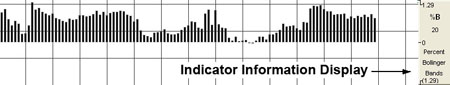
When you click
on the Indicator Information Display window the indicator information
will rotate to the next indicator you have selected (as simulated
above).
All Button
The All Button
will display all the indicators you have selected on the Indicator
toolbar in the Indicator Window. You will still be able to rotate the
information for each indicator to the right of the Indicator Window.
Note: The One
and All buttons can be specified for each chart you have open.
Back To Top
Williams
Accumulation/Distribution (AD)
Larry Williams
created this indicator in an attempt to measure market pressures. It
specifically looks for a difference in price and measures it through
market sentiment and strength. The key is to look for strong differences
between what the market does and what the indicator does. Looking for
substantial divergence from the AD index versus the underlying chart is
the key to future price direction.
The main thing
to look for is a difference between the AD and the market trend. If a
market were to make a matching or lower low, or a matching or higher
high and the AD fails to follow the market trend, this is divergence.
Divergence implies that a reversal in the dominant trend may be near.
A series of
lower lows would read as a decreasing AD. The pattern created by the AD
and the differences in the chart are what the trader looks for.
Divergence, or a difference from the pattern, is what you want to see.
For example, if the market continues to march to higher territory and
the AD follows by doing the same, then there is no divergence. However,
if the market makes several new highs but the AD fails to make new
highs, it is a warning signal of a market about to reverse direction.
Calculation
The AD index is
computed several different ways. Some computations normalize the index,
while others add extra smoothing factors through the use of moving
averages.
The first
comparison checks for accumulation. (Is the current close higher than
the previous close?) If the market is accumulating, subtract the
difference between current close and low. Add the difference to the
Accumulation/Distribution Index. Traders perceive an undervalued market
and they buy.
If Closet >
Closet-1 then ADt = ADt-1 + (Closet - Lowt)
The second
comparison checks for no change in price. If correct, the AD index does
not change.
If Closet =
Closet-1 then ADt = ADt-1
The last and
final comparison checks for a down market. It looks for the current
close below previous close. If it’s correct, the market is distributing.
The software first computes the difference between current high and
close. Then it subtracts that difference from the AD index. This
measures market distribution. Traders perceive an overvalued market and
are selling.
If Closet <
Closet-1 then ADt = ADt-1 - (Hight - Closet)
ADt:
The accumulation/distribution index for the current period.
ADt-1:
The accumulation/distribution index for the previous period.
Closet: The
closing price for the current interval.
Closet-1:
The closing price for the previous interval.
Hight: The
true high price for the current interval (current high or previous
close).
Lowt: The
true low price for the current interval (current low or previous close).
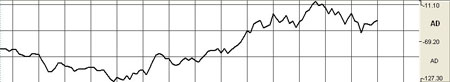
Example of the Williams AD in the Indicator Window
Preferences
Right-click on
the AD button in your Indicator toolbar and select AD Settings. The
Preferences Tab will open in the Control Panel and the AD preferences
will be displayed. (Once you click on the chart, the Preference tab will
go back to chart settings.)
Restore
Settings: TNT Default will change your settings back to the original
software settings. My Default will change current settings to your
personalized default settings. Apply To All Charts will apply your
selected settings on all open charts. Save As My Default will save your
current personal settings.
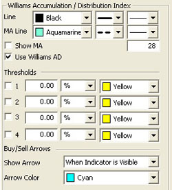 |
Line:
Choose the color, line style, and line thickness of your line and MA
line. You can also choose to show/hide the MA line and use Williams AD.
View up to four
Thresholds at values and colors of your choice. Choose when you
want Buy/Sell Arrows to show and what color.
|
Back To Top
Average True Range (ATR)
The Average True
Range Indicator was developed by Welles Wilder to work with the
commodity industry. The purpose of the ATR is to recognize the level of
volatility in a market. Volatility is a measurement of the change in
price over a given period. It is often expressed as a percentage and
computed as the annualized standard deviation of the percentage change
in daily price.
When a market is
going sideways, it typically exhibits low volatility and is difficult to
trade. A market with higher volatility is typically trending better
which would produce more opportunities to get into a trade. If a
market’s volatility is too high, traders find that the market is too
erratic, and it becomes difficult to trade. In using the ATR, traders
hope to measure the level of volatility to help them interpret the
different markets they are watching. It is important to remember to
consult other indicators or analysis so that you are not relying on only
one indicator to determine market entry or exit.
The ATR’s value
is a measurement of the market volatility. When a market is increasing
in volatility the ATR will have a higher value, and when the market is
decreasing in volatility the ATR will have a lower value.
Calculation
The ATR is a
moving average of the True Ranges defined below. The default period
interval in Track ‘n Trade 5.0 is 5 days. The ATR is calculated based on
the largest of the three distances from the following:
Today’s HIGH to
today’s LOW
Yesterday’s
CLOSE to today’s HIGH
Yesterday’s
CLOSE to today’s LOW
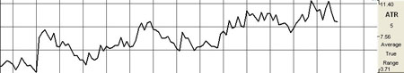
Example of the ATR in the Indicator Window
Preferences
Right-click on
the ATR button in your Indicator toolbar and select ATR Settings. The
Preferences Tab will open in the Control Panel and the ATR preferences
will be displayed. (Once you click on the chart, the Preference tab will
go back to chart settings.)
Restore
Settings: TNT Default will change your settings back to the original
software settings. My Default will change current settings to your
personalized default settings. Apply To All Charts will apply your
selected settings on all open charts. Save As My Default will save your
current personal settings.
 |
Period:
Specify the number of days to be used in calculating the ATR.
Line: Choose
the color, line style, and line thickness of your line.
View up to four
Thresholds at values and colors of your choice.
|
Back To Top
Bollinger
Bandwidth (BW)
Bollinger Bands
measure volatility by placing bands on either side of a moving average.
These bands are charted two standard deviations away from the average.
As the average changes, the values of the two standard deviations also
change. The Bollinger Bandwidth, developed by John Bollinger, represents
the expanding and contracting of the bands based on recent volatility.
During a period
of rising price volatility, the distance between the two bands will
widen (BB Width will increase). Conversely, during a period of low
market volatility, the distance between the two bands will contract (BW
will decrease).
The tendency is
for the bands to alternate between expansion and contraction. When the
bands are unusually far apart, it is often a sign that the current trend
may be ending. When the distance between the two bands has narrowed, it
is often a sign that a market may be about to begin a new trend.
The BW gives an
indication of how wide the Bollinger Bands are as a function of the
middle band. It is used to identify the squeeze at low values and the
end of trends at high values.
Calculation
The calculation
of the BW is here:
Bollinger
Bandwidth = [Top Bollinger Band (x periods)] - [Bottom Bollinger Band (x
periods)] / Simple Moving Average Close (x periods)
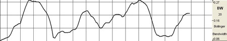
Example of the BW in the Indicator Window
Preferences
Right-click on
the BW button in your Indicator toolbar and select BW Settings. The
Preferences Tab will open in the Control Panel and the BW preferences
will be displayed. (Once you click on the chart, the Preference tab will
go back to chart settings.)
Restore
Settings: TNT Default will change your settings back to the original
software settings. My Default will change current settings to your
personalized default settings. Apply To All Charts will apply your
selected settings on all open charts. Save As My Default will save your
current personal settings.
 |
Period:
Specify the number of days to be used in calculating the BW.
% Deviation:
Define the displacement between the bands.
Type: Choose
from Simple, Linear Weight, or Exponential.
Data: Choose
from either Open, High, Low, or Close.
Line: Choose
the color, line style, and line thickness of your line.
View up to four
Thresholds at values and colors of your choice.
|
Back To Top
Commodity
Channel Index (CCI)
The Commodity
Channel Index (CCI) is designed to detect beginning and ending market
trends. The formula standardizes market prices to help spot market trend
deviations.
Donald Lambert,
the creator of this indicator, says that 70% to 80% of all price
fluctuations fall within +100 and -100 as measured by the index. The
calculation for CCI measures the average daily price’s distance from a
moving average of average daily prices.
There are basic
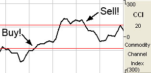
trading rules for the CCI: buy when the CCI exceeds -100 and sell when
the CCI drops below +100. In other words, a buy signal is generated when
the indicator enters the channel, or exceeds -100, coming up from the
bottom. A sell signal is generated when the indicator enters the channel
from the top, or drops below +100.
Followers of the
CCI generally look to establish long positions when the CCI exceeds the
-100 level, indicating that prices are in a strong up trend. Most users
of this indicator also try to look for patterns within the indicator,
such as higher highs, and look for CCI movements to be confirmed by
general price readings as well.
The purpose of
the CCI index is to keep you out of the market during consolidation, or
weak trending periods. By measuring the difference between average
prices and mean average prices, this indicator attempts to isolate only
strongly trending markets, similar to momentum and MACD.
When CCI is
viewed in the Indicator window of Track ‘n Trade 5.0, -100 is 33% of the
window and +100 is 66% of the window. Guides could be set at these two
points for ease in tracking CCI. You could also say that -85 would be
roughly 36% and +85 would be roughly 64% of the window.
Calculation
The proper
calculation of the CCI requires several steps in the proper sequence.
You must first compute the typical price using the high, low, and close
for the interval. Simply, take the average of the three values.
TP = (Hight +
Lowt + Closet) / 3
TPt:
Represents the typical price.
Hight: The
highest price for this interval.
Lowt: The
lowest price for this interval.
Closet: The
closing price for this interval.
Next, calculate
a simple moving average of the typical price for the number of periods
specified.
TPAVGt = (TP1 +
TP2 +... + TPn) / n
TPAVGt: The
moving average of the typical price.
TPn: The
typical price for the nth interval.
N:
Number of intervals for the average.
Compute the mean
deviation.
MDt = (|TPAVG1 -
TP1| + ... + |TPAVG1 - TPn |) / n
MDT: The
mean deviation for this interval.
TPn: The
typical price for the nth interval.
N: Number of
intervals.
Note: The
symbol | | designates absolute value. Negative differences as well as
positive differences are treated as positive values.
Final
computation:
CCIt = (TPt -
TPAVGt) / (.015 x MDT)
CCIt:
The Commodity Channel Index for the current period.
TPt: The
typical price for the current period.
TPAVGt: The
moving average of the typical price.
.015: A
constant.
MDT:
The mean deviation for this period.
Buy/Sell Signals
For a line
drawing, a buy signal occurs when the CCI line crosses from below the
lower threshold to above the lower threshold. A sell signal occurs when
the CCI line crosses from above the upper threshold to below the upper
threshold.
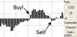
For a histogram
drawing, a buy signal occurs when the CCI value crosses from below the 0
line to above the 0 line. A sell signal occurs when the CCI value
crosses from above the 0 line to below the 0 line.
Preferences
Right-click on
the CCI button in your Indicator toolbar and select CCI Settings. The
Preferences Tab will open in the Control Panel and the CCI preferences
will be displayed. (Once you click on the chart, the Preference tab will
go back to chart settings.)
Restore
Settings: TNT Default will change your settings back to the original
software settings. My Default will change current settings to your
personalized default settings. Apply To All Charts will apply your
selected settings on all open charts. Save As My Default will save your
current personal settings.
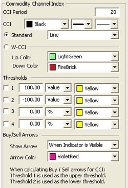 |
CCI
Period: The number of bars, or interval, used to calculate the
study. Default is 20.
CCI: Choose
the color, line style, and line thickness of your line. Select
Standard and choose between a line or a histogram from the dropdown
menu. Select W-CCI to display a histogram divided in the middle
and choose two colors from the dropdown menu.
View up to four
Thresholds at values and colors of your choice. When calculating
buy/sell signals, Threshold 1 is used as the upper threshold and
Threshold 2 is used as the lower threshold (default values set at 100
and -100).
Choose when you
want Buy/Sell Arrows to show and what color.
|
Back To Top
Chaikin Money
Flow (CMF)
The Chaikin
Money Flow Indicator is an oscillator developed by Marc Chaikin. An
oscillator is an indicator that is used as a counter trend showing when
the market is overbought or oversold. These indicators are momentum
based. The CMF is based largely on the Accumulation Distribution Line;
it compares the close value with the high and the low for that same day.
By comparing the
close to the high and low, the CMF is determining if the market has
pressure to sell or buy. In doing this, the CMF is giving an indication
of overbought and oversold by using these comparisons. If the market is
consistently closing in the top region of the price bar and there is an
increase in volume (showing an increase in the number of trades) then
CMF exhibits a positive value. If the market is consistently closing in
the bottom region of the price bar and there’s an increase in volume,
CMF exhibits a negative value.
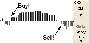
When the CMF
indicator crosses the zero line either up or down, this is an indication
of a change in trend. Traders use this indicator to help confirm
breakout signals from either support or resistance trend lines.
Calculation
The calculation
of the CMF is here:
CMF = SUM(AD, n)
/ SUM(VOL, n)
where n = Period
AD = VOL x (CL -
OP) / (HI - LO)
AD stands for Accumulation Distribution
Buy/Sell Signals
A buy signal
occurs when the CMF value crosses from below the 0 line to above the 0
line. A sell signal occurs when the CMF value crosses from above the 0
line to below the 0 line.
Preferences
Right-click on
the CMF button in your Indicator toolbar and select CMF Settings. The
Preferences Tab will open in the Control Panel and the CMF preferences
will be displayed. (Once you click on the chart, the Preference tab will
go back to chart settings.)
Restore
Settings: TNT Default will change your settings back to the original
software settings. My Default will change current settings to your
personalized default settings. Apply To All Charts will apply your
selected settings on all open charts. Save As My Default will save your
current personal settings.
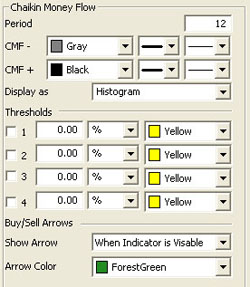 |
Period:
Specify the number of days to be used in calculating the CMF.
CMF+/CMF-:
Choose the color, line style, and line thickness of your lines.
Display as:
Choose between displaying CMF as a histogram or a line.
View up to four
Thresholds at values and colors of your choice. Choose when you
want Buy/Sell Arrows to show and what color.
|
Back To Top
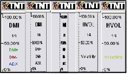
Directional Movement Index (DMI)
Wilder’s DMI is
similar to the historic volatility indicator because it shows market
tendencies. The main use of this tool is to show the strength of a
trend. This could direct the trader to use a trend following system or a
counter trend system in their trading. It also indicates possible price
reversals.
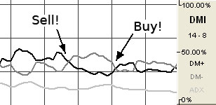
Directional
Moving Index is plotted as three lines on a scale of 0 to 100. This
scale is a measure of market trend. The two lines of DMI show the amount
of positive and negative movement. The positive line is called D+ and
the negative D-. The direction of these lines and the use of crossovers
can show the changes in the current market. The key to this indicator is
the ADX, or average of the difference of these two lines. The ADX is the
main factor in using this indicator. During periods of extreme price
variation the two lines can become very volatile, and the ADX is used to
compensate for this.
The best
application of DMI is present when used with another indicator. DMI
should either confirm or contradict the indicator being used. It is also
best to use DMI in long-term trade situations. Because the study is not
as sensitive as other indicators it is appropriate to use it as a
confirmation tool. When the DMI is advancing, the average is higher on
the 0 to 100 scale, trend following systems are best employed. Likewise,
with a decreasing DMI average, the line is lower on the scale, closer to
0, so a counter trend system might be best. These traits represent the
fact that as the average line goes higher in the scale the strength of
the trend is gaining, and as the ADX goes lower the trend is losing
strength. It is also important to look at the individual lines for
changes in price movement.
The other
application for DMI is to look at the D+ and D- lines themselves. When
the D+ line crosses above the D- line a buy signal is initiated. This
indicates that the positive price direction is greater than the
negative. Conversely, once the D+ line crosses below the D- line, a sell
trigger is present. The negative price movement is overtaking the
positive.
Welles Wilder
himself said that he was not comfortable using these two lines by
themselves. When looking at reversals, the ADX should be above both
lines, and once it turns lower we should see a change in market
direction. You should also look to ADX for confirmation.
This application
is much the same as momentum, showing a change in the market sentiment.
Wilder also says that a trend following system should not be used when
the ADX line is below both D lines, as this means that the market has no
discernible direction.
When using the
D+ and D- crossover method, Wilder stresses the use of an extreme point.
On the day the crossover occurs, the extreme point is the high or low of
the day (high for a buy, and low for a sell). The market should be able
to take out that price and stay beyond it for several days before the
trade is initiated or exited. This use of extreme points should keep the
trader from getting into whipsaws or false breakouts.
Calculation
The computations
needed to generate the final figures for the DMI are not complex but are
numerous and lengthy. The following discussion attempts to unravel the
computational mysteries of the DMI. If you need further explanation,
please refer to the author’s original work. The book titled New
Concepts in Technical Trading Systems by J. Welles Wilder, Jr.,
explains this indicator and several others.
You must first
compute the directional movement, DM, for the current trading interval.
Directional movement can be up, down, or zero. If directional movement
is up, it is labeled as +DM, and -DM refers to downward directional
movement. Wilder defines directional movement as the largest part of the
current trading range that is outside the previous trading range. From a
mathematical view, it is the largest value between two equations:
Hight - Hight-1
or Lowt - Lowt-1
This is only
true when the current low is less than the previous low, or the current
high exceeds the previous high. Both of these conditions do not have to
be met, only one. It is the largest portion of the trading range outside
of the previous trading range.
It is possible
for the directional movement to be zero. This occurs when the current
trading range is inside the previous trading range, or when the trading
ranges, current versus previous, are equal.
Directional
movement is up, or positive, when the difference between the highs is
the greatest. It is down, or negative, when the difference between the
lows is the largest value. The up directional movement is +DM and down
directional movement is -DM. Do not let the plus and minus sign
designation mislead you. They only indicate upward or downward movement,
not values. The directional movement value is always a positive number,
or absolute value, regardless of upward or downward movement. This
concept is crucial to understanding the computations for the indicator.
If you are confused, draw some illustrations or work with actual price
data to determine the directional movement values.
The next step in
determining the DMI is to compute the true range. The true range (TR) is
always a positive number. According to the Wilder, the true range is the
largest value of three equations:
Hight - Lowt
Hight - Closet-1
Lowt - Closet-1
Continue this
process for the specified trading interval. In this example, use a value
of 14. This is the same value Wilder used on daily data. His logic for
using this value is that it represents an average half-cycle period.
When this task is accomplished for the specified interval, you compute
the average value of the +DM, -DM, and TR. Wilder prefers to use an
accumulation technique rather than computing a pure moving average. It
is a short cut designed to save computational time and effort:
Averaget =
(Averaget-1 - (Averaget-1 / n)) + Valuet
When you
substitute the above symbols, you these equations:
+DMt = (+DMt-1 -
(+DMt-1 / n)) + (+DMt)
-DMt = (-DMt-1 -
(-DMt-1 / n)) + (-DMt)
TRt = (TRt-1 -
(TRt-1 / n)) + (TRt)
It is a
timesaving convention. This indicator was developed before
microcomputers were invented. The only tool available was the desktop
calculator or adding machine. You could spend a great deal of time and
effort calculating averages.
You now have the
average values. The next step is to compute the directional indicator.
It can be either up or down, depending upon the directional movement. On
up intervals use this calculation:
+DI = (+DM / TR)
x 100
On a down
interval use this formula:
-DI = (-DM / TR)
x 100
The plus and
minus directional indicator values are computed as percentage figures.
You are expressing the percentage of the average true range for both up
and down trading intervals.
If you have
followed this process so far, the last few steps are relatively simple.
You compute the difference between the +DI and the -DI. Remember to use
the absolute value of this difference (Convert any negative value into a
positive number).
DIdiff = |
((+DI) - (-DI)) |
Compute the sum
of the directional indicator values using this formula:
DIsum = ((+DI) +
(-DI))
Once you compute
the DIdiff and the DIsum, you can calculate the DX or directional
movement index. This value is always a percentage:
DX = (DIdiff /
DIsum) x 100
The DX is always
a value between 0 and 100. If your calculations exceed this range, you
have made an error. Wilder was not comfortable using just the
directional movement index. It could become very volatile during periods
of extreme price movement, especially markets that rise and fall
quickly. He implements his accumulated moving average technique to
smooth the DX. The result is the ADX or average directional movement
index. This is the computational procedure:
ADXt = ( (ADXt-1
x (n - 1) ) + DXt) / n
Buy/Sell Signals
A buy signal
occurs when the DMI+ line crosses from below the DMI- line to above the
DMI- line. A sell signal occurs when the DMI+ line crosses from above
the DMI- line to below the DMI- line.
Filters to Adjust Buy/Sell Signals
Extreme Point
Validation : This filter delays the buy/sell
arrows at least a day by requiring that the market move higher or lower
than the high or low on the day the DM+,DM- crossover happened. If a new
high or low is not obtained before the next DM+,- crossover, the
buy/sell arrow is suppressed completely for that previous period. The
filter does not require the use of DX/ADX, although it does stack with
the other filers if they are used.
Trend Strength:
The DX or ADX line must be above the target number before a DM+,- cross
will give a buy/sell arrow. The theory is the DX/ADX lines indicate
trend strength (not direction) and if it is below 20 there is
practically no trend. Values above 40 indicate a strong trend. Different
articles would use values between 20 and 40 as targets to look for. This
box must be selected for this rule to be available.
Turning Point
Validation: The directional index line (DX or ADX) must be above the
point where DM+,- crossed. This is like a variable trend strength
filter. The directional index can indicate any trend strengths as long
as the trend strength is greater than the value of the DM+,- crossing
point. This indicator also requires that the directional index line be
on.
Preferences
Right-click on
the DMI button in your Indicator toolbar and select DMI Settings. The
Preferences Tab will open in the Control Panel and the DMI preferences
will be displayed. (Once you click on the chart, the Preference tab will
go back to chart settings.)
Restore
Settings: TNT Default will change your settings back to the original
software settings. My Default will change current settings to your
personalized default settings. Apply To All Charts will apply your
selected settings on all open charts. Save As My Default will save your
current personal settings.
 |
DMI
Period: The number of bars, or interval, used to calculate the
study. Default is 14.
ADX Period:
Specify the number of price bars used in calculating ADX.
DMI+, DMI-,
DM: Choose the color, line style, and line thickness of your
line. Select Use Relative Scaling to change the 100% location to
the highest point value in the DMI indicator.
View up to four
Thresholds at values and colors of your choice. Threshold 1 is
used for Trend Strength (default value set at 40).
Choose when you
want Buy/Sell Arrows to show and what color. Select if you would
like to view Extreme Point Validation, Trend Strength, or
Turning Point Validation filters.
|
Back To Top
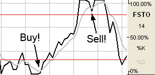
Fast Stochastics
(FSTO)
The Stochastic
Process was invented by Dr. George C. Lane under the basic premise that
during periods of decrease, daily closes tend to accumulate near the
extreme low of the day and, conversely, during periods of increase,
daily closes tend to accumulate near the extreme highs of the day.
This indicator
is designed to show conditions of overbought and oversold markets.
Stochastics are divided into two types: Regular Stochastics, often
referred to as Fast Stochastics, and Slow Stochastics. Fast Stochastics
are more sensitive to price changes and can give a lot in the
short-term, hence the need for Slow Stochastics.
Stochastics
display two lines that move in a vertical scale between 0 and 100,
representing percentiles from 0% to 100%. Think of the level of
Stochastics as where the most current close is within a specific range.
If Stochastics are reading 50%, the current close is in the middle of
the price range for a specified period of time. If Stochastics are
reading 100%, the close is at the high of the range, and 0% represents
the current close price being at the low of the range. This will help
you to understand why Stochastics are a counter trend indicator, in that
the underlying principle behind Stochastics is that prices will move
back to the center of the trading range, or the opposite extreme.
When both lines
move to an area below 20 on this scale they are said to be in an
oversold zone. Conversely, when both %K and %D move to above 80 on this
same scale they are indicating an overbought zone. It is this indication
of market sentiment that makes this counter trend indicator useful.
George Lane
emphasized that the most important signal generated by this method was
the difference or divergence between %D and the underlying market price.
He said that the divergence is where %D line makes a group of lower
highs while the market makes a series of higher highs. This would
indicate an overbought condition. The reverse would be true of an
oversold market, with %D making higher lows and prices making lower
lows.
As with a dual
moving average system, when the faster reacting indicator crosses the
slower moving indicator, a buy or sell is signaled. Because Stochastics
give an indication of either overbought or oversold, you would first
want to see both lines in the above 80 or below 20 range, and sloping
out of that range back to the middle before looking for these trade
triggers.
Calculation
The first step
in computing the stochastic indicator is to determine the n
period high and low. Suppose you specified twenty periods for the
stochastic. Determine the highest high and lowest low during the last
twenty trading intervals. It determines the trading range for that time
period. The trading range changes on a continuous basis. The
calculations for the %K is here:
%Kt = ( (Closet
- Lown) / (Highn - Lown) ) x 100
%Kt: The
value for the first %K for the current time period.
Closet:
The closing price for the current period.
Lown: The
lowest low during the n periods.
Highn: The
highest high during the n time periods.
n: The value
you specify.
Once you obtain
the %K value, you start computing the %D value which is an accumulative
moving average. Since the %D is a moving average of a moving average, it
requires several trading intervals before the values are calculated
properly. If you specify a 20 period stochastic, the software system
requires 26 trading intervals before it can calculate valid %K and %D
values. The formula for the %D is here:
%DT = ( (%DT-1 x
2) + %Kt) / 3
%DT:
The value for %D in the current period.
%DT-1: The
value for %D in the previous period.
%Kt: The
value for %K in the current period.
The values 2 and
3 are constants. You specify the constants and the length of the time
period to examine for the trading range.
Buy/Sell Signals
A buy signal
occurs when both lines are below the lower threshold and the %K line
crosses from below the %D line to above the %D line. A sell signal
occurs when both lines are above the upper threshold and the %K line
crosses from above the %D line to below the %D line.
Preferences
Right-click on
the FSTO button in your Indicator toolbar and select FSTO Settings. The
Preferences Tab will open in the Control Panel and the FSTO preferences
will be displayed. (Once you click on the chart, the Preference tab will
go back to chart settings.)
Restore
Settings: TNT Default will change your settings back to the original
software settings. My Default will change current settings to your
personalized default settings. Apply To All Charts will apply your
selected settings on all open charts. Save As My Default will save your
current personal settings.
 |
FSTO
Period: The number of periods to be used to determine the highest
high and lowest low. Default is 14.
FSTO Smoothing:
The number of periods to be used to determine the moving average for the
%D value.
%K/%D:
Choose the color, line style, and line thickness of your %K and %D
lines.
Calculation:
Choose between Exponential, Simple, and Wilder’s Smoothing calculations.
View up to four
Thresholds at values and colors of your choice. When calculating
buy/sell signals, Threshold 1 is used as the upper threshold and
Threshold 2 is used as the lower threshold (default values set at 80 and
20).
Choose when you
want Buy/Sell Arrows to show and what color.
|
Back To Top
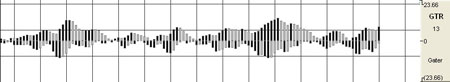
Gator (GTR)
Fractal geometry
and nonlinear dynamics is used to create the method of calculations for
the Gator Indicator. Used in combination with the Alligator, an Overlay
Indicator, the Gator has proved to be effective at pinpointing large
market trends.
The Gator was
created on a relative scale; what seems to be a large move in the market
today may well be just a small move on the historical scale, since the
Gator graphically represents itself only against its own historical
price line. As the market trends, the Gator will also trend, causing
historical representations of market momentum and movement to pale in
comparison.
Example of the
GTR in the Indicator Window
Preferences
Right-click on
the GTR button in your Indicator toolbar and select GTR Settings. The
Preferences Tab will open in the Control Panel and the GTR preferences
will be displayed. (Once you click on the chart, the Preference tab will
go back to chart settings.)
Restore
Settings: TNT Default will change your settings back to the original
software settings. My Default will change current settings to your
personalized default settings. Apply To All Charts will apply your
selected settings on all open charts. Save As My Default will save your
current personal settings.
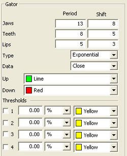 |
Jaws,
Teeth, Lips: Specify your periods and shift
specifications.
Type: Select
Simple, Linear Weight, or Exponential.
Data: Choose
the data you would like to be calculated.
Up/Down:
Select the color of the histogram when the value is up or down.
View up to four
Thresholds at values and colors of your choice.
|
Back To Top
Historic Volatility (HVOL)
The Historic
Volatility indicator is used mainly as an option evaluation tool. It
does not give trading signals like those given with other technical
indicators. It gives the trader an idea of how volatile the market has
been for a previous period of time.
Changing the
period of time the study observes allows the trader to finetune options
prices. If a market has been extremely volatile for the past 3 months,
for example, near term options should be more expensive. If the market
has been calm for an extended period of time, longer term options should
be reasonable. In futures, we use it for observation. It tells us if
prices are calming down or becoming more erratic.
The key to using
historic volatility is determining the correct period of time for each
market. The market you are looking at may show a history of volatility
years ago, but has been relatively calm the last few months. Getting an
idea of the markets behavior recently may be of no use to the trader
that is looking at distant options.
For the futures
trader, this tool is useful as a guide for order placement. Changing
market volatility may indicate that it is time to move stops closer or
farther away. If the trader is profitable with the trend and volatility
is changing, it might be a time to move stops closer to protect profits.
If a trader is trading against the trend, he might want to move stops
further away to avoid getting bumped out prematurely.
Options traders
could use this study to help them purchase profitable options. The basic
idea is to buy options when volatility is decreasing to take advantage
of a change in that volatility. Any rise in volatility will translate to
an increase in option values. Look at options strategies that take
advantage of low volatility, such as straddles or ratio spreads. When
volatility is high, selling options would be better because any decrease
in volatility will translate to a loss of option value. Option
strategies that take advantage of a decrease in volatility are strangles
and regular short option positions.
Obviously,
historic volatility is only one component of option pricing. Any changes
in the underlying futures market could negate the changes in option
prices due to volatility. For example, if you were to buy a low
volatility Put option and prices go higher, that option will lose value
but not as quickly as a higher volatility option.
For the futures
trader, the basic concept is to expect market changes during periods of
increased volatility. George Soros, the trading legend, said "Short term
volatility is greatest at a turn around and diminishes as a trend
becomes established."
This indicator
is commonly viewed as very mean regressive. What this term means is that
the historic volatility indicator tends to return to the opposite end of
the spectrum and therefore return to an average. If volatility is great
it will eventually cool off and return to that place. If volatility is
low it will not stay quiet forever. What this means to traders is that a
market that is erratic will sooner or later calm down and a market that
is quiet will eventually get loud again.
Calculation
The calculation
for the historical volatility is rather involved. The number of periods
per year vary depending on the type of price chart used for the study.
The following table lists the number of periods for each type of chart:
| Chart Type |
Trading Periods Per Year |
| Perpetual |
262 |
| Daily |
262 |
| Weekly |
52 |
| Monthly |
12 |
| Variable |
Based on chart period (see below) |
| Tick |
Not available for this study |
When using
variable charts, you must first calculate the number of trading periods
per year. To do this, you must determine the trading time of the
selected commodity. The formula is as follows:
TP = (Tt / Pn) x
262
TP:
The total number of trading periods per year.
Tt: The
total trading time in a day.
Pn: The
length of the period.
262: The
number of weekdays per year.
Example: The
S&P 500 trades from 8:30 a.m. to 3:15 p.m. That is a total trading time
of 6 hours and 45 minutes. On a variable chart using 5 minute bars, the
number of periods for the day is 81:
6 hours x 60
minutes = 360 minutes + 45 minutes
Total minutes of
trading = 405 minutes
405 / 5 minute
bars = 81 trading periods per day
Now that you
have calculated the trading periods per day, you now must calculate the
number of periods for the year. Since historical volatility considers
every weekday of the year when calculating total periods for the year,
the multiplier is 262:
TP = (405/5) x
262
TP = 81 x 262
TP = 21,222
Note:
This formula applies only to historical volatility on
a variable chart. It does not apply to other chart types.
Now that you
have the total number of periods per year, continue with the calculation
of the historical volatility, by calculating the logarithm of the price
change for each price in the specified time span of n periods:
LOGSi = LOG(Pi /
Pi-1)
LOG:
The logarithm function.
Pi:
The current price.
Pi-1: The
previous price.
Now that you
have the logarithms of the price changes, calculate the total logarithms
for the time span you are reviewing:
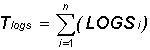
Tlogs: The
total of the logarithm price ratio for the time span.
S: Indicates
to sum all n logarithms.
LOGSi: The
logarithm of the price change for period i.
N:
The number of periods for the specified time span.
The next step is
to calculate the average of the logs by dividing the total logarithm by
the number of periods:
ALOGS = Tlogs /
n
ALOGS:
The average of the logarithms.
Tlogs: The
total of the logarithm for the time span.
N: The
number of periods for the specified time span.
The last
calculation is to sum the squares of the difference between the
individual logarithms for each period and the average logarithm:
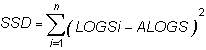
SSD: The sum
of the squared differences.
S: Indicates
to total the squares of all n differences.
LOGSi: The
logarithm of the price change for period i.
ALOGS: The
average of the logarithms.
Now that the
elements of the final formula are complete, the following formula
calculates the historical volatility for a given period over a specified
time span:
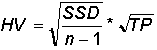
SSD: The sum
of the squared differences.
n: The
number of periods for the specified time span.
TP: The
total number of trading periods for the year.
Due to the
complexity of the formula, it is preferable to use a scientific
calculator when attempting to manually calculate the historical
volatility of a futures instrument.
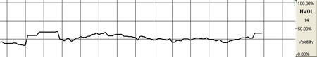
Example of
Historical Velocity in the Indicator Window
Preferences
Right-click on
the HVOL button in your Indicator toolbar and select HVOL Settings. The
Preferences Tab will open in the Control Panel and the HVOL preferences
will be displayed. (Once you click on the chart, the Preference tab will
go back to chart settings.)
Restore
Settings: TNT Default will change your settings back to the original
software settings. My Default will change current settings to your
personalized default settings. Apply To All Charts will apply your
selected settings on all open charts. Save As My Default will save your
current personal settings.
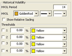 |
HVOL
Period: The number of bars, or period, used to calculate the study.
Default is 20. You may use any number greater than 1 for the close.
HVOL: Choose
the color, line style, and line thickness of your line. Click to Show
Relative Scaling if you want the 100% location to be changed to the
highest point value in the indicator.
View up to four
Thresholds at values and colors of your choice.
|
Back To Top
Know Sure Thing
(KST)
The Know Sure
Thing (KST) Indicator is an oscillator developed by Martin J. Ping that
gives bullish and bearish momentum signals. The difference between this
indicator and other oscillators is that it takes into consideration four
time periods instead of only one. Each time period is smoothed using a
moving average. Also, each time period is weighted differently depending
on length, so a longer time period would have greater weight. Because of
the consideration of the various time periods, the KST is able to react
quicker to price moves.
Watch for
bullish and bearish momentum signals in the KST indicator. When the KST
turns upward, this is a bullish signal, and when the KST turns down,
this is a bearish signal. More confirmation is given when the trigger
line crosses the KST line as a result of the change in direction.
There are two
lines: the trigger line and the KST line. The KST line is a result of
the four moving averages smoothed as well as the Rate of Change or ROC.
The trigger line is a moving average of the KST.
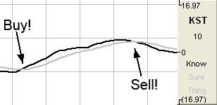
Buy/Sell Signals
A buy signal
occurs when the KST line is below the 0 line and crosses from below the
trigger line to above the trigger line. A sell signal occurs when the
KST line above the 0 line and crosses from above the trigger line to
below the trigger line.
Preferences
Right-click on
the KST button in your Indicator toolbar and select KST Settings. The
Preferences Tab will open in the Control Panel and the KST preferences
will be displayed. (Once you click on the chart, the Preference tab will
go back to chart settings.)
Restore
Settings: TNT Default will change your settings back to the original
software settings. My Default will change current settings to your
personalized default settings. Apply To All Charts will apply your
selected settings on all open charts. Save As My Default will save your
current personal settings.
 |
MA:
Specify the number of days used in calculating the period and ROC period
of the 1, 2, 3, and 4 moving average lines.
Trigger Period:
Specify the number of days used in calculating the trigger period.
Choose between a histogram or line.
Type: Choose
if you would like to see KST as a histogram or line.
Calculation:
Choose between Simple, Linear Weight, and Exponential.
KST/Trigger:
Choose the color, line style, and line thickness of your KST and trigger
lines.
View up to four
Thresholds at values and colors of your choice. Choose when you
want Buy/Sell Arrows to show and what color.
|
Back To Top
Moving Average
Convergence/Divergence (MACD)
MACD was created in an attempt to determine the strength of a trend along with the direction of that trend. Gerald Appel created a system that looked at two exponential moving averages and the difference between those two averages. Looking at the difference of these moving averages of the market we are able to see clear buy and sell signals.
Computing this indicator requires the use of exponential moving averages (EMA) with the first one generally being a smaller period than the second. Exponential moving averages are different than simple moving averages; instead of looking at only the last few days and averaging them, the exponential averages look at all the prices and puts more weight on the most recent data. This type of weighted average gives a smoother average price that reacts quickly to market moves. The difference of the two averages is the MACD. It moves above and below a zero base line, the distance from which gives indication of the strength of the current move. A buy or sell condition is indicated as the MACD crosses from below to above or from above to below the zero line. When in MACD mode, the indicator key will be labeled MACD.
Often an additional exponential moving average of the MACD is used to act as a trigger line. A bullish crossover occurs when the MACD crosses to above it's trigger, and a bearish crossover occurs when it crosses to below the trigger. When the trigger is active the buy or sell arrows are keyed off of these cross over instead of the default baseline crossover. An additional trigger filter is available to only indicate sells when the MACD-trigger crossover is above the base line and only indicate buys when it is below the zero base line.
In addition to charting the MACD and it's trigger, you can chart just the difference of the MACD and it's trigger. When charting the difference the trigger period is used again to create a fourth exponential moving average on the trigger. This trigger of the trigger, if enabled, will adjust the location of the buy/sell signals using the same rules as explained above for the trigger on the MACD. When in Difference mode, the indicator key will be labeled MACDD.
Finally you can chart both the MACD, with optional trigger, and the difference. This mode uses the same rules as the chart MACD mode for determining buy/sell arrows. The option to chart as a line or histogram will go away and the MACD and it's optional trigger will be plotted as a line. The MACD-trigger difference will be plotted as a histogram. When in Both mode, the indicator key will be labeled MACDB.
When MACD is plotted as a histogram, the values used to plot the histogram are the differences between the two moving averages on each day. The "trigger" line that appears on this chart is an average of the histogram data, or a smoothed view of the histogram.
Using the MACD as a histogram will allow the trader to spot divergences between the indicator and the market price. A divergence is present when the market makes a higher high than the previous high, but the MACD histogram fails to make a corresponding higher high. This is considered to be a sign of weakness and a sell signal when the MACD breaks below the lowest point in between the divergent highs.
Calculation
In this study,
the oscillator is the simple difference between the first two
exponential moving averages:
MACDt = (EMA1 - EMA2)
MACDt: The MACD value for the current interval.
EMA1: The
first exponential moving average.
EMA2: The
second exponential moving average.
The second part
of the study computes an exponential moving average of the oscillator:
Triggt = Trigt-1+ (k x (MACDt - Trigt-1))
Trigt: The trigger value for the current interval.
MACDt: The MACD for the current interval.
Trigt-1: The trigger value for the previous interval.
k:
The exponential smoothing constant.
Since the second value, Trigt, is an exponential moving average, it rises and falls slower than the MACD, and the two lines generate crossover points. These crossover points are the buy/sell signals when Trigger is enabled.
If the study is
displayed as a histogram, each value for the lines is calculated:
DIFFt = MACDt - Trigt
DIFFt:
The difference between the oscillator for the current interval and
the exponential moving average of the oscillator.
MACDt: The oscillator for the current interval.
Trigt: The exponential moving average of the oscillator.
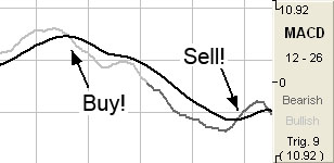
Buy/Sell Signals
For a line
drawing, a buy signal occurs when the MACD crosses from below the
trigger line to above the trigger line, and the trigger line is less
than 0. A sell signal occurs when the MACD line crosses from above the
trigger line to below the trigger line, and the trigger line is greater
than 0. (A histogram drawing with the trigger line works similarly.)
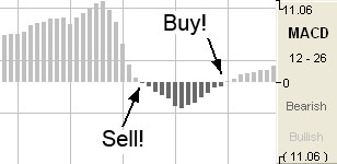
For a histogram
drawing, a buy signal occurs when the MACD value crosses from below the
0 line to above the 0 line. A sell signal occurs when the MACD value
crosses from above the 0 line to below the 0 line.
Preferences
Right-click on the MACD button in your Indicator toolbar and select MACD Settings. The Preferences Tab will open in the Control Panel and the MACD preferences will be displayed. (Once you click on the chart, the Preference tab will go back to chart settings.)
Restore Settings: TNT Default will change your settings back to the original software settings. My Default will change current settings to your personalized default settings. Apply To All Charts will apply your selected settings on all open charts. Save As My Default will save your current personal settings.
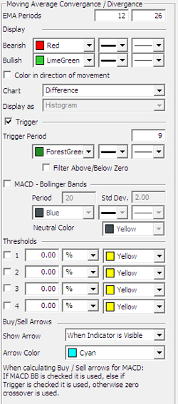 |
EMA Periods: The first box is used to specify the first EMA with a default of 12. The second box is for the second EMA with a default of 26.
Bearish/Bullish:
Choose the color, line style, and line thickness of your line.
Color in direction of movement:
Instead of changing bullish/bearish color at the zero line crossover, change it when the indicator is going up or down.
Chart:
Switch between MACD, Difference and Both charting modes as defined previously.
Display as:
The MACD indicator can be displayed differently. From the dropdown menu, choose either to view it as a line or as a histogram.
Trigger:
Check this box to hide the Trigger line. You can also change the color
and line style of the Trigger.
Trigger Period:
Specify the number of days.
MACD:
Bollinger Bands: See MACD Bollinger Bands.
|
Calculation:
Select "Standard" or "Extra Smoothing" to choose how you would like your
chart to be calculated. (Extra Smoothing is a proprietary formula
developed by Lan H. Turner, president and CEO of Gecko Software, Inc.
This method increases the movement in the MACD indicator and has shown
to be more accurate [in Gecko Software’s market testing] than the
standard calculation. Its relationship to the MACD is similar to the
relationship between the Fast and Slow Stochastics, think of this
indicator as the "Fast MACD.")
View up to four
Thresholds at values and colors of your choice. Choose when you
want Buy/Sell Arrows to show and what color.
Back To Top
Money Flow Index
(MFI)
The MFI is a
momentum based indicator, similar to the RSI, %R, and CCI. The MFI
incorporates a more rigid calculation, giving the tell tale signs of a
more rigid line and a better indication of money flowing in or out of
any given security.
The theory says
that as money flows into the equity, or volume increases, the MFI will
increase its rate of climb. As money flows out of the equity, volume
decreases, and the MFI will decrease its rate of climb. The MFI is a
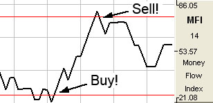
classic overbought/oversold indicator based on a 0-100 scale. When the
MFI reaches up above the top threshold, which is traditionally set at
75-80%, the equity is considered overbought and a retracement is
anticipated. When the MFI line reaches below the 20-25% threshold, the
underlying equity is considered oversold and a reversal is anticipated
once again.
Calculation
The calculation
of MFI is here:
Money Flow =
(Typical Price) x (Volume)
Buy/Sell Signals
A buy signal
occurs when the MFI line crosses from below the lower threshold to above
the lower threshold. A sell signal occurs when the MFI line crosses from
above the upper threshold to below the upper threshold.
Preferences
Right-click on
the MFI button in your Indicator toolbar and select MFI Settings. The
Preferences Tab will open in the Control Panel and the MFI preferences
will be displayed. (Once you click on the chart, the Preference tab will
go back to chart settings.)
Restore
Settings: TNT Default will change your settings back to the original
software settings. My Default will change current settings to your
personalized default settings. Apply To All Charts will apply your
selected settings on all open charts. Save As My Default will save your
current personal settings.
 |
Period:
Specify the number of days to be used in calculating the MFI.
Line: Choose
the color, line style, and line thickness of your line.
View up to four
Thresholds at values and colors of your choice. When calculating
buy/sell signals, Threshold 1 is used as the upper threshold and
Threshold 2 is used at the lower threshold (default values set at
75 and 25).
Choose when you
want Buy/Sell Arrows to show and what color.
|
Back To Top
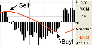
Momentum (MOM)
The momentum
indicator describes how price changes occur. It is a measure of the
price change and shows if prices are increasing or decreasing at a
continuous rate. Momentum can help gauge the current market trend. This
indicator will sometimes shift ahead of a price change. It is both an
indicator of trend as well as an indicator of a changing trend. The main
thing to look for when using it is a divergence or difference between
price behavior and the indicators behavior.
Momentum
measures the rate of change in prices rather than actual price levels
themselves. By measuring this rate of incline or decline, momentum tells
whether the current trend is strengthening or weakening. If prices are
rising and the momentum indicator is above the zero line, then the trend
is gaining strength. If prices were rising but the indicator was sagging
or went below the zero line, then we would interpret this as a sign of a
coming change in trend. This is true because, although prices were still
increasing, they are doing so at a decreasing rate.
The reverse
would be true during a declining market. For example, think of a race
car gaining 20 miles an hour each lap, until it starts to only gain 15
miles an hour, then 10 mph, then 5 mph until eventually it reaches its
top speed. Like a race car, a market can not sustain growing momentum
forever, and in many occurrences momentum slows before prices change
direction.
Typically, the
trade signals are to buy when the momentum indicator crosses from below
the zero line to above it. This indicates that a new upward trend has
begun, as the market is able to violate resistance levels and continue
higher with increasing speed.
The sell signal
would be to sell when the line crosses from above the zero line to below
it. This indicates that the market is picking up speed to the downside
and should be able to violate support areas. It is in this way that this
unique indicator is a trend following tool.
Another way to
use momentum is to establish regions of overbought or oversold. For
example, in a declining market, the prices continue downward and the
momentum indicator moves toward more negative but begins to level out.
We would be looking for a buy signal when the indicator turned upward
and out of that oversold region. It is in this way that momentum can
sometimes shift ahead of the price movement. This use of the momentum
indicator is a counter trend usage.
In either
implementation of this indicator, the key is divergence. Seeing momentum
make lower highs while prices are making higher highs, or momentum
making higher lows while prices are making lower lows. Being aware of a
difference in price movement and the momentum level can help the trader
make informed trading decisions.
Calculation
The general
formula to calculate momentum is here:
MOMt = Pi - Pi-n
MOMt: The
momentum indicator for the current period.
Pi:
The price of the i interval.
Pin: The
price n intervals ago.
n: The
number of intervals or length specified.
Example:
Assume the current price is 7470. This example examines a momentum study
using a length of ten trading intervals. The price ten intervals ago is
7400:
MOM = 7470 -
7400 = +70
The momentum
value can have a very broad range. It is a function of the length you
select for the momentum and the volatility of the underlying futures
contract. Thus, it could swing very wide and wildly about the zero line.
Buy/Sell Signals
If we draw MOM
with the MOMMA line, a sell signal occurs when the MOM value crosses
from below the MOMMA line to above the MOMMA line, and the MOMMA line is
greater than 0. A buy signal occurs when the MOM value crosses from
above the MOMMA line to below the MOMMA line, and the MOMMA line is less
than 0.
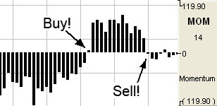
If we draw MOM
without the MOMMA line, a buy signal occurs when the MOM value crosses
from below the 0 line to above the 0 line. A sell signal occurs when the
MOM value crosses from above the 0 line to below the 0 line.
Preferences
Right-click on
the MOM button in your Indicator toolbar and select MOM Settings. The
Preferences Tab will open in the Control Panel and the MOM preferences
will be displayed. (Once you click on the chart, the Preference tab will
go back to chart settings.)
Restore
Settings: TNT Default will change your settings back to the original
software settings. My Default will change current settings to your
personalized default settings. Apply To All Charts will apply your
selected settings on all open charts. Save As My Default will save your
current personal settings.
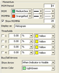 |
MOM
Period: The number of bars, or period, to be used to calculate the
study. You must determine a value suitable to your trading needs and
methods. Some technicians argue that the length of the momentum
indicator should equal the normal price cycle. The best method is to
experiment with different lengths until you find the length that works
best for that particular commodity you are trading.
MOM/MA:
Choose the color, line style, and line thickness of your line. Uncheck
the Show MOMMA box if you would like to hide the Momentum Moving
Average line. You can also specify the number of days used in
calculating the MOMMA line.
Display as:
The MOM indicator can be displayed differently. From the dropdown menu,
choose either to view it as a line or as a histogram.
View up to four
Thresholds at values and colors of your choice. Choose when you
want Buy/Sell Arrows to show and what color.
|
Back To Top
On Balance
Volume (OBV)
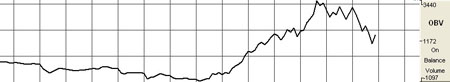
The OBV
indicator adds a period volume when the close is up and then subtracts
the period’s volume when the indicator closes down. An accumulated
volume total forms the OBV line. When comparing this calculated price
line, with the underlying security, we look for areas of convergence and
divergence to confirm our market’s directional movement.
The concept
behind the OBV is that changes will be reflected in the OBV prior to the
markets change. A rise in volume is meant to indicate a rise in money
inflows to the security. Once the public continues to add money, the
price of the equity should continue to rise.
Directional
movement in the indicator gives foresight into the market direction. A
rise in the OBV indicator gives the trader the indication that markets
are on the rise; a dropping OBV is an indication of a weakening market
and lower prices are soon to follow.
When market
divergence is seen within the OBV indicator, one must take heed that the
market is either weakening in a bullish trend, or strengthening in a
bearish trend, and a market reversal is about to occur. The actual
calculated value of the line itself is of little use, but the visual
movement of the line is what’s important to the trader. An inclining
line is the indication of a strengthening market, and a declining line
is representative of declining market strength.
Example of the
OBV in the Indicator Window
Preferences
Right-click on
the OBV button in your Indicator toolbar and select OBV Settings. The
Preferences Tab will open in the Control Panel and the OBV preferences
will be displayed. (Once you click on the chart, the Preference tab will
go back to chart settings.)
Restore
Settings: TNT Default will change your settings back to the original
software settings. My Default will change current settings to your
personalized default settings. Apply To All Charts will apply your
selected settings on all open charts. Save As My Default will save your
current personal settings.
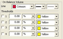 |
Line:
Choose the color, line style, and line thickness of your line.
View up to four
Thresholds at values and colors of your choice.
|
Back To Top
Percent Price Oscillator (PPO)
The PPO
indicator shows the relationship between two moving averages. The PPO
indicator is a modification of the highly regarded and effective MACD
indicator. This enhancement provides us the ability to receive the
differences between the two moving averages as a percentage. This allows
the trader to easily compare stocks with different prices. For example,
a PPO result of 20 means that the short term average is 20% above the
long term average.
Calculation
To calculate the
PPO, subtract the 26-day exponential moving average (EMA) from the
nine-day EMA and divide this difference by the 26-day EMA. The end
result is a percentage that tells the trader where the short-term
average is relative to the longer-term average.
PPO = (Fast_EMA
- Slow_EMA) / Fast_EMA
Additionally,
the PPO histogram can be calculated by using the MA of a PPO itself:
PPO_Histogram =
PPO - EMA_PPO
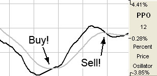
Buy/Sell Signals
A buy signal
occurs when the PPO line crosses from below the trigger line to above
the trigger line. A sell signal occurs when the PPO line crosses from
above the trigger line to below the trigger line.
Preferences
Right-click on
the PPO button in your Indicator toolbar and select PPO Settings. The
Preferences Tab will open in the Control Panel and the PPO preferences
will be displayed. (Once you click on the chart, the Preference tab will
go back to chart settings.)
Restore
Settings: TNT Default will change your settings back to the original
software settings. My Default will change current settings to your
personalized default settings. Apply To All Charts will apply your
selected settings on all open charts. Save As My Default will save your
current personal settings.
 |
PPO
Periods: Specify the number of days to be used in calculating the
PPO.
PPO: Choose
the color, line style, and line thickness of your PPO line.
Trigger:
Specify the number of days used in calculating the Trigger.
Line: Choose
the color, line style, and line thickness of your Trigger line.
Build With:
Choose either Close, Open, High, or Low to build with.
View up to four
Thresholds at values and colors of your choice. Choose when you
want Buy/Sell Arrows to show and what color.
|
Back To Top
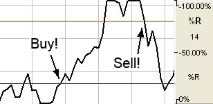
Williams Percent
R (%R)
Larry Williams
used a ten-day period and plotted where the current price was compared
to that period. He used it to measure conditions of overbought and
oversold; the overbought region being the area below 20% and the
oversold region the area above 80%. With the ability to invert the
values, it can be looked at in the same manner as other
overbought/oversold indicators. Note: We will use the traditional
method, not the inverted, in our discussions. Choosing the time period
which the indicator looks at the interval is crucial to finding the
optimal sensitivity.
Williams’s basic
rule is simple: when the %R is lower than 20% and becomes greater than
20%, it is interpreted as a buy signal. Conversely, when the %R is
higher than 80% and becomes lower than 80%, a sell signal is activated.
Changing the
sensitivity of the indicator to work for you is essential to making the
study a better tool. The longer the period for the %R, the less
sensitive it will be. The indicator will move less but will be more
smoothed. A number of technical traders use a value that is less
volatile, or in other words, a larger value. Many traders find it better
to use a strategy where the market leaves the areas of overbought/
oversold before entering a trade position. In either case, using solid
exit strategies is important with this indicator.
Calculation
You must first
determine the highest high and lowest low for the length of the
interval. This is the trading range for the specified interval:
%Rt = ( (Highn -
Closet) / (Highn - Lown) ) x -100
%Rt:
The percent of the range for the current period.
Highn: The
highest price during the past n trading periods.
Closet: The
closing price for the current period.
Lown: The
lowest price during the past n trading periods.
n: The
length of the interval.
Example:
Assume the market is Treasury Bills. The high for the past ten trading
intervals is 9275, and the low is 9125. The closing price in the current
period is 9267.
This is what you
get if you substitute those values in the equation:
%R = ( (9275 -
9267) / (9275 - 9125) ) x 100
= (8 / 150) x
100
= 5.33
%Rt = ( (Closet
- Lown) / (Highn - Lown) ) x -100
Buy/Sell Signal
A buy signal
occurs when the %R line crosses from below the lower threshold to above
the lower threshold. A sell signal occurs when the %R line crosses from
below the upper threshold to below the upper threshold.
Preferences
Right-click on
the %R button in your Indicator toolbar and select %R Settings. The
Preferences Tab will open in the Control Panel and the %R preferences
will be displayed. (Once you click on the chart, the Preference tab will
go back to chart settings.)
Restore
Settings: TNT Default will change your settings back to the original
software settings. My Default will change current settings to your
personalized default settings. Apply To All Charts will apply your
selected settings on all open charts. Save As My Default will save your
current personal settings.
 |
%R
Period: The number of price bars, or the interval, used to calculate
the study. Default is 10.
%R: Choose
the color, line style, and line thickness of your line.
Calculation:
Choose between common or updated calculations.
View up to four
Thresholds at values and colors of your choice. When calculating
buy/sell signals, Threshold 1 is used as the upper threshold and
Threshold 2 is used as the lower threshold (default values set at 80 and
20).
Choose when you
want Buy/Sell Arrows to show and what color.
|
Back To Top
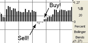
Percent
Bollinger Bands (%B)
Bollinger Bands
are calculated as a simple moving average shifted up and down by a
number of standard deviations. Percent Bollinger Bands relate the
underlying price of an instrument to the range of these Bollinger Bands.
This gives the user an adaptive measure of volatility which can be used
in the same way as other momentum indicators. Buy when the indicator
bottoms below 0.00 and turns up, and sell when the indicator peaks above
100.00 and turns down.
You can also use
the indicator by looking for divergence between the indicator and the
charts. Sharp price advances and declines usually accompany market tops
and bottoms, and as a market climbs or falls toward a bottom, the
indicator will tend to initially follow the price trend and then fall
off, leading to bullish or bearish divergences with the chart.
Buy Sell Signals
A buy signal
occurs when %B value crosses from below the 0 line to above the 0 line.
A sell signal occurs when %B value crosses from above the 0 line to
below the 0 line.
Preferences
Right-click on
the %B button in your Indicator toolbar and select %B Settings. The
Preferences Tab will open in the Control Panel and the %B preferences
will be displayed. (Once you click on the chart, the Preference tab will
go back to chart settings.)
Restore
Settings: TNT Default will change your settings back to the original
software settings. My Default will change current settings to your
personalized default settings. Apply To All Charts will apply your
selected settings on all open charts. Save As My Default will save your
current personal settings.
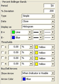 |
Period:
Specify the number of days to be used in calculating the %B.
% Deviation:
Define the displacement between the bands.
Type: Choose
from Simple, Linear Weight, or Exponential.
Data: Choose
from Open, High, Low, or Close.
Display as:
Choose to view as a Histogram or Line.
B+/B-:
Choose the color, line style, and line thickness of your line.
View up to four
Thresholds at values and colors of your choice. Choose when you
want Buy/Sell Arrows to show and what color.
|
Back To Top
Price Volume
Oscillator (PVO)
The PVO is
primarily used to identify periods of expanding or contracting volume.
Centerline
Crossovers: The PVO oscillates above and below the zero line. A PVO
above zero indicates that volume levels are generally above average and
relatively heavy. When the PVO is below zero, volume levels are
generally below average and light. When PVO is positive, the shorter EMA
of volume is greater than the longer EMA of volume. When PVO is
negative, the shorter EMA of volume is less than the longer EMA of
volume.
Directional
Movement: The general overall direction of the PVO gives the trader
a visual of market momentum and direction. A rising PVO signals volume
levels are increasing, and a falling PVO signals volume levels are
decreasing.
Moving Average
Crossovers: The last variable in the PVO forms the signal line. For
example, PVO (12,26,9) would include a 9-day EMA of PVO as well as a
histogram representing the difference between the PVO and its 9-day EMA.
When PVO moves above its signal line, volume levels are generally
increasing. When PVO moves below its signal line, volume levels are
generally decreasing.
Movements in the
PVO are completely separate from price movements. Movements in PVO can
correlate with price movements to assess the degree of buying or selling
pressure.
Calculation
The calculation
of PVO is here:
Volume
Oscillator (%) - PVO = [(Vol 12-day EMA - Vol 26-day EMA)/Vol 12-day EMA]
x 100
Increasing and
decreasing the exponential moving average variables changes the PVO to
reflect a longer or shorter trading time period. The absolute values of
the PVO indicator are not as important as the crossovers of the moving
averages as well as a crossover above or below the zero line.
There are three
additional methods on the next page of acquiring market strength and
weakness information from the PVO.
When the PVO
crosses above the zero line, volume is increasing and an increase in
price is anticipated.
When the PVO
crosses below the zero line, volume is decreasing and a decrease in
price and a weakening market are anticipated.
Simple
directional movement can be one of the greatest strengths of the PVO
indicator. When the line is ascending, volume is increasing, so
therefore markets should increase. When the line is descending,
volume is decreasing, therefore the market should weaken and
decrease.
Buy/Sell Signals
A buy signal
occurs when the PVO line crosses from below the trigger line to above
the trigger line. A sell signal occurs when the PVO line crosses from
above the trigger line to below the trigger line.
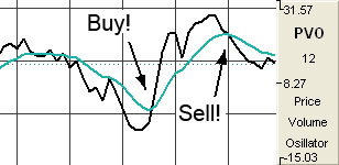
Preferences
Right-click on
the PVO button in your Indicator toolbar and select PVO Settings. The
Preferences Tab will open in the Control Panel and the PVO preferences
will be displayed. (Once you click on the chart, the Preference tab will
go back to chart settings.)
Restore
Settings: TNT Default will change your settings back to the original
software settings. My Default will change current settings to your
personalized default settings. Apply To All Charts will apply your
selected settings on all open charts. Save As My Default will save your
current personal settings.
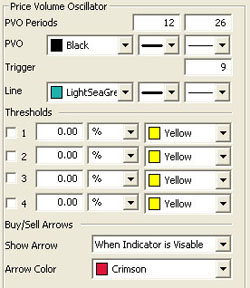 |
PVO
Periods: Specify the number of days to be used in calculating the
PVO.
PVO: Choose
the color, line style, and line thickness of your line.
Trigger:
Specify the number of days used in calculating the trigger period.
Line: Choose
the color, line style, and line thickness of your trigger line.
View up to four
Thresholds at values and colors of your choice. Choose when you
want Buy/Sell Arrows to show and what color.
|
Back To Top
Rate of Change (ROC)
The ROC
indicator is used to help a trader determine the rate at which a market
is either increasing or decreasing in strength or weakness. A rising
rate of change indicates an advancing market, while a decreasing rate of
change indicates a declining market. As the rate of change line
approaches the centerline, the rate of change is considered to be in
equilibrium. This is somewhat of a misnomer, since the ROC is on a
relative scale and scales against historical rates. What is equilibrium
today will not be the equilibrium line down the road, and what is not
equilibrium today will appear to be so from a historical point of view.
Comparing the
ROC’s of different time-spans improves the accuracy of the analysis. A
12 month period is usually the most reliable for long-term trends, and a
3 or 6 month period works well for intermediate trends. A 10 or 12-day
ROC is a good short-term indicator, oscillating in a fairly regular
cycle.
The lower the
ROC, the more undersold the market and the more likely a recovery.
Although the opposite may hold true in that the higher the ROC, the more
overbought the market, both extremes can indicate the formation of a
sideways channel.
Calculations
The calculation
for the ROC is here:
ROC = 100 x
(Today’s close - Close 10 periods ago) / (Close 10 periods ago)
Example of the
ROC in the Indicator Window
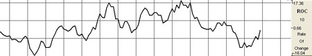
Preferences
Right-click on
the ROC button in your Indicator toolbar and select ROC Settings. The
Preferences Tab will open in the Control Panel and the ROC preferences
will be displayed. (Once you click on the chart, the Preference tab will
go back to chart settings.)
Restore
Settings: TNT Default will change your settings back to the original
software settings. My Default will change current settings to your
personalized default settings. Apply To All Charts will apply your
selected settings on all open charts. Save As My Default will save your
current personal settings.
 |
Period:
Specify the number of days to be used in calculating the SRSI.
Line: Choose
the color, line style, and line thickness of your line.
View up to four
Thresholds at values and colors of your choice.
|
Back To Top
Relative Strength Index (RSI)
The RSI was
developed by J. Welles Wilder, Jr., as a measure of the market’s
strength or weakness. The principle idea of this study is that it will
indicate a general zone that the market is in, either the buy zone or
the sell zone. This indicator is similar to Stochastics in that it shows
regions of overbought and oversold. This indicator should be
incorporated into a system rather than using it by itself. Wilder’s
popular indicator is known for its accuracy and its ability to
compensate for erratic price movement.
RSI computes the
difference in recent prices as a solid line and plots this line on a
scale similar to the scale used by Stochastics. The area above 70 is
generally considered to be the overbought region, and the region below
30 is referred to as the oversold region. Simply selling in the
overbought region and buying when the RSI is in the oversold region is
not a consistent method of trade. Trade signals are not generated until
the RSI leaves these regions. A sell signal would not be present until
the RSI has begun sloping down and leaves the 70 region.
A buy signal, in
the simple methodology associated with this pattern, is derived when RSI
leaves the oversold region, crosses from below 30 to above it. Just like
sell signals, RSI buy signals are present when the market begins to turn
and the indicator leaves the oversold region.
Another use of
the RSI is to look for a divergence in prices, in the case of a market
making higher highs or lower lows and the RSI failing to follow suit.
This difference in the indicator and the market could be a signal that
the market lacks the momentum to continue its current price direction.
So, you may be able to take a position sooner using this strategy, than
you would with the previous way. Wilder says that this divergence is
"the single most indicative characteristic of the RSI."
In its
calculation the RSI indicator uses a moving average of price changes
over the period. You can select which type of moving average is used to
produce the desired amount of smoothing on the RSI indicator.
Calculation
The RSI
computations are not difficult, but they are tedious. You first
calculate the difference between the current closing price and the
previous closing price:
DIFt = Closet -
Closet-1
If that
difference is a positive value, then it is an up period, which means the
current close is higher than the previous close. If the difference is
negative, then it is a down period, which means the current close is
below the previous close. The DOWN value is always a positive number for
all computations. It is the absolute value of a negative DIF. The
worksheet on the next page shows the calculations needed to create a 9
period RSI.
| Day |
Current Close |
Previous Close |
Dif |
Up |
Down |
| 1 |
7450 |
7430 |
+20 |
20 |
0 |
| 2 |
7460 |
7450 |
+10 |
10 |
0 |
| 3 |
7470 |
7460 |
+10 |
10 |
0 |
| 4 |
7480 |
7470 |
+10 |
10 |
0 |
| 5 |
7485 |
7480 |
+5 |
5 |
0 |
| 6 |
7490 |
7485 |
+5 |
5 |
0 |
| 7 |
7480 |
7490 |
-10 |
0 |
10 |
| 8 |
7470 |
7480 |
-10 |
0 |
10 |
| 9 |
7455 |
7470 |
-15 |
0 |
15 |
| |
|
|
Totals |
60 |
35 |
You now compute
the up and down averages:
Ut = (UP1 +... +
UPn) / n
Dt = (DOWN1 +...
+ DOWNn) / n
UT: The up
average for the current period.
DT: The down
average for the current period.
UPn: The UP
value for the nth period.
DOWNn: The
DOWN value for the nth period.
n:
The number of periods for the RSI.
Use the values
from the worksheet to find the up average:
U = 60 / 9
= 6.67
Use the same
values to find the down average:
D = 35 / 9
= 3.89
The general
formula for the RSI:
RSIt = ( UT /
(UT + DT) ) x 100
Use the general
formula with the above values:
RSI = ( 6.67 / (
6.67 + 3.89 )) x 100
= 63.16
Assume the
market continues the downward trend. The next DIF value is -15, which
sets the UP value to 0 and the DOWN value to 15. Calculate the next up
and down average by using Wilder’s accumulative moving average
technique:
UT = ( (UT-1 x
(n-1) ) + UPt) / n
= ( (6.67 x (9
-1) ) + 0) / 9
= 5.93
DT = ( ( DT-1 x
(n-1) ) + DOWNt) / n
= ( ( 3.89 * (9
- 1) ) + 15) / 9
= 5.12
The value for
the new RSI equals 53.67:
RSI = ( (5.93) /
(5.93 + 5.12)) x 100
= 53.67
Buy/Sell Signals
A buy signal
occurs when the RSI line crosses from below the lower threshold to above
the lower threshold. A sell signal occurs when the RSI line crosses from
above the upper threshold to below the upper threshold.
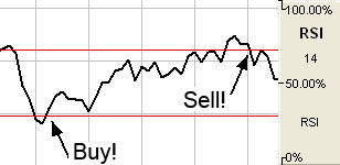
Preferences
Right-click on
the RSI button in your Indicator toolbar and select RSI Settings. The
Preferences Tab will open in the Control Panel and the RSI preferences
will be displayed. (Once you click on the chart, the Preference tab will
go back to chart settings.)
Restore
Settings: TNT Default will change your settings back to the original
software settings. My Default will change current settings to your
personalized default settings. Apply To All Charts will apply your
selected settings on all open charts. Save As My Default will save your
current personal settings.
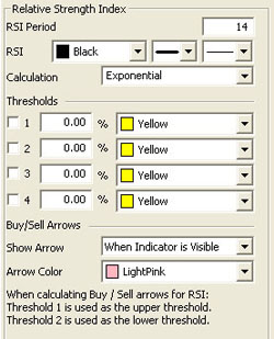 |
RSI
Period: The number of bars, or period, used to calculate the study.
Default is 14.
RSI: Choose
the color, line style, and line thickness of your line.
Calculation:
Choose between Exponential, Simple, and Wilder’s Smoothing calculations.
View up to four
Thresholds at values and colors of your choice. When calculating
buy/sell signals, Threshold 1 is used as the upper threshold and
Threshold 2 is used as the lower threshold (default values set at 70 and
30).
Choose when you
want Buy/Sell Arrows to show and what color.
|
Back To Top
Stochastic
Relative Strength Index (SRSI)
The Stochastics
indicator is an oscillator that compares a securities closing price in
relationship to its price range over a given period of time. The RSI
indicator is also an oscillator which represents the internal strength
of the equities price. Both these indicators work on an overbought and
oversold formula.
The Stochastics
RSI is a combination of these two indicators, where the %K within the
Stochastics formula is replaced by the RSI. The formula is then set on a
0 to 100 scale for both the Stochastics indicator as well as the RSI is
read in much the same manner as the traditional RSI. When the SRSI
reaches up into the upper region above the upper threshold line, the
market is considered overbought and anticipate a reversal of the trend.
When the SRSI reaches down into the lower region below the lower
threshold, the market is considered oversold and a reversal is
anticipated. Traditionally, the upper threshold marker is set at 70% and
the lower marker is set at 30%.
Calculation
The calculation
for the SRSI is here:
StochRSI = (RSI
- LowRSIn) / (HighRSIn - LowRSIn)
RSI: The
current level of the RSI indicator.
LowRSIn: The
lowest level the RSI reached over the last n periods.
HighRSIn:
The highest level the RSI reached over the last n periods.
Buy/Sell Signals
A buy signal
occurs when the SRSI line crosses from below the lower threshold to
above the lower threshold into the channel. A sell signal occurs when
the SRSI line crosses from above the upper threshold to below the upper
threshold into the channel.
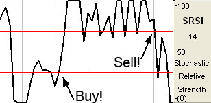
Preferences
Right-click on
the SRSI button in your Indicator toolbar and select SRSI Settings. The
Preferences Tab will open in the Control Panel and the SRSI preferences
will be displayed. (Once you click on the chart, the Preference tab will
go back to chart settings.)
Restore
Settings: TNT Default will change your settings back to the original
software settings. My Default will change current settings to your
personalized default settings. Apply To All Charts will apply your
selected settings on all open charts. Save As My Default will save your
current personal settings.
 |
SRSI
Period: Specify the number of days to be used in calculating the
SRSI.
Underlying RSI
Period: Specify the number of days used in calculating the
Underlying RSI.
Calculation:
Choose from Exponential, Simple, or Wilder’s Smoothing.
Line: Choose
the color, line style, and line thickness of your line.
View up to four
Thresholds at values and colors of your choice. When calculating
buy/sell signals, Threshold 1 is used as the upper threshold and
Threshold 2 is used as the lower threshold (default values set at 70 and
30).
Choose when you
want Buy/Sell Arrows to show and what color.
|
Back To Top
Slow Stochastics
(SSTO)
The slower
version of Stochastics is commonly believed to be a more reliable
indicator. In this version of Stochastics, the more sensitive %K line is
dropped. The original %D now becomes the slower line %K. The new %D is a
3-day moving average of the %K. This basically gives you a smoothed
version of the original indictor. This modified counter trend indicator
is less reactive but considered to be more accurate.
Slow Stochastics
are interpreted the same as Fast Stochastics. Quite often the faster of
the two indicators moves in and out of the overbought/oversold regions
quickly.
Calculation
The calculations
for the slow stochastic are similar to the normal stochastic. The first
step in computing the stochastic indicator is to determine the n
period high and low. Suppose you specified twenty periods for the
stochastic. Determine the highest high and lowest low during the last
twenty trading intervals. It determines the trading range for that time
period. The trading range changes on a continuous basis.
The calculations
for the %K is here:
%Kt = ( (Closet
- Lown) / (Highn - Lown) ) x 100
%Kt: The
value for the first %K for the current time period.
Closet: The
closing price for the current period.
Lown: The
lowest low during the n periods.
Highn: The
highest high during the n time periods.
n: The value
you specify.
Once you obtain
the %K value, you start computing the %D value, which is an accumulative
moving average. Since the %D is a moving average of a moving average, it
requires several trading intervals before the values are calculated
properly. If you specify a 20 period stochastic, the software system
requires 26 trading intervals before it can calculate valid %K and %D
values. The formula for the %D is here:
%DT = ( (%DT-1 x
2) + %Kt) / 3
%DT: The
value for %D in the current period.
%DT-1: The
value for %D in the previous time period.
%Kt: The
value for %K in the current period.
The values 2 and
3 are constants. You specify the constants and the length of the time
period to examine for the trading range.
Once the %K and
%D values for the normal stochastic are derived, the slow stochastic can
be computed. The formula for the slow stochastic is here:
%KSLOW = %DNORMAL
%DSLOWt = ( ( %D
SLOWt-1 x 2 ) + %K SLOWt-1 ) ) / 3
%KSLOW: The
%D for the normal stochastic.
%DSLOWt:
Slow %D value for the current period.
%DSLOWt-1:
The slow %D for the previous period.
%KSLOWt-1:
The slow %K for the previous period.
The values 2 and
3 are the smoothing constants. You may select different values.
Buy/Sell Signals
A buy signal
occurs when the %K line crosses from below %D to above %D and both lines
are less than the lower threshold. A sell signal occurs when the %K line
crosses from above the %D line to below the %D line and both lines are
greater than the upper threshold.
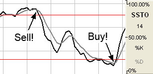
Preferences
Right-click on
the SSTO button in your Indicator toolbar and select SSTO Settings. The
Preferences Tab will open in the Control Panel and the SSTO preferences
will be displayed. (Once you click on the chart, the Preference tab will
go back to chart settings.)
Restore
Settings: TNT Default will change your settings back to the original
software settings. My Default will change current settings to your
personalized default settings. Apply To All Charts will apply your
selected settings on all open charts. Save As My Default will save your
current personal settings.
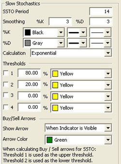 |
SSTO
Period: The number of periods used to determine the highest high and
lowest low. Default is 14.
Smoothing:
The number of periods used to determine the moving average for the %K
and %D values.
%K/%D:
Choose the color, line style, and line thickness of your %K and %D
lines.
Calculation:
Choose between Exponential, Simple, and Wilder’s Smoothing calculations.
View up to four
Thresholds at values and colors of your choice. When calculating
buy/sell signals, Threshold 1 is used as the upper threshold and
Threshold 2 is used as the lower threshold (default values set at 80 and
20).
Choose when you
want Buy/Sell Arrows to show and what color.
|
Back To Top
Triple
Exponential Average (TRIX)
The TRIX
indicator is a momentum indicator designed to calculate the percent rate
of change of a triple exponentially smoothed moving average. It is very
similar in the way the MACD indicator works. Both indicators provide
basically the same methodology behind generating market momentum and
directional movement.
TRIX was
designed to filter out the minor, less significant moves within a market
trend. This is done, just as other traditional indicators have done in
the past, by utilizing multiple moving averages.
Convergence and
Divergence are common uses of the TRIX indicator. Adding the trigger
line crossover provides the trader with a Buy/Sell Signal generated from
the crossing of the two moving averages.
Calculation
To calculate
TRIX, first pick a period with which to create an exponential moving
average of the closing prices. For a 15-day period the calculations
would look like this:
Calculate the
15-day exponential moving average of the closing price.
Calculate the
15-day exponential moving average of the moving average calculated in
step #1.
Calculate the
15-day exponential moving average of the moving average calculated in
step #2.
The result is
triple exponentially smoothing the moving average of closing prices,
greatly reducing volatility.
Finally,
calculate the 1-day percent change of the moving average calculated in
step #3.
Buy/Sell Signals
A buy signal
occurs when the TRIX value crosses from below the trigger line to above
the trigger line. A sell signal occurs when the TRIX value crosses from
above the trigger line to below the trigger line.
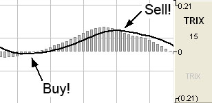
Preferences
Right-click on
the TRIX button in your Indicator toolbar and select TRIX Settings. The
Preferences Tab will open in the Control Panel and the TRIX preferences
will be displayed. (Once you click on the chart, the Preference tab will
go back to chart settings.)
Restore
Settings: TNT Default will change your settings back to the original
software settings. My Default will change current settings to your
personalized default settings. Apply To All Charts will apply your
selected settings on all open charts. Save As My Default will save your
current personal settings.
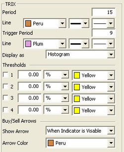 |
Period:
Specify the number of days to be used in calculating the SRSI.
Line: Choose
the color, line style, and line thickness of your line.
Trigger Period:
Specify the number of days used in calculating the Underlying RSI.
Line: Choose
the color, line style, and line thickness of your trigger line.
Display as:
Choose if you want to see a histogram or line.
View up to four
Thresholds at values and colors of your choice. Choose when you want
Buy/Sell Arrows to show and what color.
|
Back To Top
Ultimate
Oscillator (ULT)
This is another
indicator introduced by Mr. Larry Williams. It seems to be another
modification of the RSI indicator, as is his %R indicator. If you lay
the three indicators on your chart, you’ll see many similarities. The
advantage of the ULT indicator is that the trader is given two
additional variables in the formula to modify and finetune the action
and reaction to the market price.
This indicator,
as with the RSI indicator, works on an overbought and oversold region.
Mr. Williams states that the upper threshold should start at 70% and the
lower threshold at 30%, but depending on the market, the volatility, and
the settings, you may need to adjust the thresholds to either higher or
lower settings to obtain signals.
Once the ULT
line crosses above the upper threshold into the overbought region, it is
time to anticipate a reversal in price and lower prices to ensue. When
the ULT line crosses below the lower threshold, it is time to anticipate
a reversal in price and anticipate prices to rise once again. Many
traders like to use a 50% line to reconfirm price action. Crossing the
50% line is a confirmation of the overall trend.
Calculation
The True Low
(TL) is the lower of today’s low or yesterday’s close. Calculate today’s
Buying Pressure (BP) like this:
BP = Today’s
close - Today’s TL
Calculate
today’s True Range (TR) by finding the largest outcome of one of the
following equations:
TR = Today’s
High - Today’s Low
Today’s High - Yesterday’s Close
Today’s Close - Today’s Low
Calculate
BPSum1, BPSum2, and BPSum3 by adding up all of the BPs
for each of the three specified time frames. Calculate TRSum1,
TRSum2, and TRSum3 the same way with the TR’s.
The Raw Ultimate
Oscillator (RawUO) is calculated here:
RawUO = 4 x
(BPSum1 / TRSum1) + 2 x (BPSum2 / TRSum2) + (BPSum3 / TRSum3)
The Final
Ultimate Oscillator is calculated here:
FUO = [ RawUO /
(4 + 2 + 1) ] x 100
Buy/Sell Signals
A buy signal
occurs when the ULT line crosses from below the lower threshold to above
the lower threshold. A sell signal occurs when the ULT line crosses from
above the upper threshold to below the upper threshold.
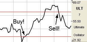
Preferences
Right-click on
the ULT button in your Indicator toolbar and select ULT Settings. The
Preferences Tab will open in the Control Panel and the ULT preferences
will be displayed. (Once you click on the chart, the Preference tab will
go back to chart settings.)
Restore
Settings: TNT Default will change your settings back to the original
software settings. My Default will change current settings to your
personalized default settings. Apply To All Charts will apply your
selected settings on all open charts. Save As My Default will save your
current personal settings.
|
 |
ULT
Periods: Specify the number of days to be used in calculating the
SRSI.
Line: Choose
the color, line style, and line thickness of your line.
View up to four
Thresholds at values and colors of your choice. When calculating
buy/sell signals, Threshold 1 is used as the upper threshold and
Threshold 2 is used as the lower threshold (default values set at 70 and
30).
Choose when you
want Buy/Sell Arrows to show and what color.
|
Back To Top
Volume/Open
Interest (V/OI)
Volume is a
measurement of the number of contracts traded in a day. It is a sign of
market activity. Open Interest is the number of contracts outstanding or
those held overnight. This is a measure of market participation. In
liquid markets, these numbers will be consistently higher than in a thin
or illiquid market. These numbers are always a day behind, because it
takes the exchange that long to tabulate these figures. When displayed,
Track ‘n Trade 5.0 offsets these values to put them beneath their
respective data in the chart, consequently there is not a value for
either volume or open interest for the most recent day of any contract.
Volume and Open Interest indicate participation and urgency. This tells
the trader which market is the correct one to be in based on its
participation.
Volume measures
the number of contracts that changed hands during that trading session.
This indicator of market activity can show whether trade was heavy or
light, giving you an idea of the possible volatility present in that
market. Contracts that have not been settled at the end of the day are
represented by open interest. New buyers and sellers entering or exiting
the market change open interest.
The key to this
indicator is to look at volume as a percentage of open interest. V/OI
does not give straight buy or sell signals or have set trading rules.
Rather it shows the cyclical tendencies of the market. The flow of the
underlying market can be represented. Looking at V/OI shows whether new
buyers or sellers are entering the market or if they are liquidating
positions.
There are basic
common sense rules for this indicator. If the prices are up and V/OI is
increasing, the market is strong. If the prices are up and V/OI is
declining, the market is getting weaker. If the prices are down and V/OI
is rising, the market is getting stronger. If the prices are down and V/OI
is declining, the market is getting weaker.
In bull markets,
volume tends to increase during rallies, and tends to decrease on
reactions. In bear markets, volume tends to increase on declines and
decrease during rallies. Trading volume usually increases dramatically
at tops and bottoms.
Looking at the
volume and open interest will show you which contract month to be in.
When looking at trading a specific commodity, it is important to know
which contract month to be in. Commodities expire or are delivered
several times a year. This creates a situation where traders are
constantly "rolling over" from one contract month to the next. This
means that traders need to know which month to be in. V/OI is the tool
that shows us which contract month to be in. The months that have the
highest open interest are usually the best to be in because they are the
most liquid. The months that have higher volume will afford the trader a
better opportunity to enter and exit the market.
Calculation
This study has
no computations. The values for the volume and open interest are
transmitted from the exchanges. However, the actual volume and open
interest figures are always one day behind price information. You will
not know Monday’s volume and open interest until Tuesday at
approximately noon (for U.S. markets - central time). That is due to the
exchanges and their reporting requirements.
Example of V/OI
in the Indicator Window
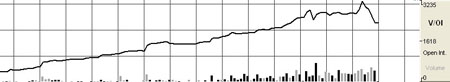
Preferences
Right-click on
the V/OI button in your Indicator toolbar and select V/OI Settings. The
Preferences Tab will open in the Control Panel and the V/OI preferences
will be displayed. (Once you click on the chart, the Preference tab will
go back to chart settings.)
Restore
Settings: TNT Default will change your settings back to the original
software settings. My Default will change current settings to your
personalized default settings. Apply To All Charts will apply your
selected settings on all open charts. Save As My Default will save your
current personal settings.
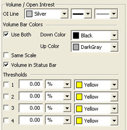 |
OI
Line: Choose the color, line style, and line thickness of your line.
Volume Bar
Colors: Choose the colors for your down and up bars.
Selecting
Same Scale will make the volume and open interest amounts on the
same value scale.
Volume in Status
Bar: Choose if you would like to see the volume amount in the status
bar at the bottom of your screen. By deselecting, the Open Interest
value will appear in its place.
View up to four
Thresholds at values and colors of your choice.
|
Back To Top
|