|
|
Overlay Indicators
Learn to Analyze the Signs and Signals
Overlay Indicators
in the Chart Window
To display an
Overlay Indicator, right-click the Chart Window and select Chart
Overlays. Select the name of the Overlay Indicator that you would
like to view from the dropdown menu. A checkmark will appear next to any indicators you have selected
and all selected indicators will show directly on your chart, not in the
indicator window. To remove an overlay indicator from your chart, click
on the indicator in the dropdown menu again and the checkmark with
disappear.
Right-Click Menu
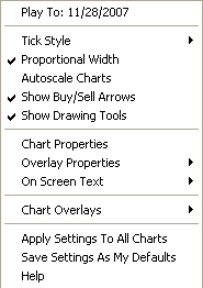 |
Tick Style , Proportional Width,
Autoscale Charts, and Show Buy/Sell Arrows are explained
in the Chartbooks section of the Getting Started chapter.
If you select
Chart Properties, the chart preferences will open in the Control
Panel. You can use this to change how your chart, price bars, and rulers
look. (See the Charting Preferences section of the Getting Started
chapter.)
To view the
preferences for one of your indicators, right-click the Chart Window and
select Overlay Properties. Any overlay indicators you have
displayed will appear in the menu to the side. Select the indicator you
would like to modify, and the preferences will open in the Control
Panel.
|
The Overlay
Properties option will only appear in your right-click menu if you have
an overlay indicator displayed.
Highlight On
Screen Text and select if you would like to view indicator values on
the chart window and where you would like them to be located on your
chart.
Use Chart
Overlays to display or remove individual Overlay Indicators.
The Apply
Settings To All Charts and Save Settings As My Defaults options work
just like the similar buttons in the Preferences section of your control
panel. Apply Settings To All Charts will apply your selected settings on
all open charts. Save Settings As My Defaults will save your current
personal settings.
Back To Top
Alligator
A unique use of
fractal geometry and nonlinear dynamics is used to create the method of
calculations for the Alligator Indicator. Used in combination with the
Gator Indicator, the Alligator has proved to be effective at pinpointing
large market trends.
Example of the
Alligator
Components
Alligator’s Jaw
(blue line): The Balance Line for the timeframe that was used to build
the chart (13 period Smoothed Moving Average, moved into the future by 8
bars).
Alligator’s
Teeth (red line): The Balance Line for the value timeframe of one level
lower (8 period Smoothed Moving Average, moved by 5 bars into the
future).
Alligator’s Lips
(green line): The Balance Line for the value timeframe, one more level
lower (5 period Smoothed Moving Average, moved by 3 bars into the
future).
The Lips, Teeth,
and Jaw of the Alligator show the interaction of different time periods.
As clear trends can be seen only 15 to 30 percent of the time, it is
essential to follow them and refrain from working on markets that
fluctuate only within certain price periods.
When the Jaw,
Teeth and Lips are closed or intertwined, the Alligator is going to
sleep or is asleep already. As it sleeps, it gets hungrier and hungrier:
the longer it sleeps, the hungrier it will be when it wakes up. The
first thing it does after it wakes up is to open its mouth and yawn.
Then the smell of food comes to its nostrils: flesh of a bull or flesh
of a bear, and the Alligator starts to hunt it. Having eaten enough to
feel quite full, the Alligator starts to lose interest in the food/price
(Balance Lines join together), and this is the time to fix the profit.
Preferences
Right-click
anywhere on the chart and go to “Overlay Properties.” Select Alligator
from the list. The preferences will appear in the Control Panel. (Once
you click on the chart, the Preference tab will go back to chart
settings.)
Restore
Settings: TNT Default will change your settings back to the original
software settings. My Default will change current settings to your
personalized default settings. Apply To All Charts will apply your
selected settings on all open charts. Save As My Default will save your
current personal settings.
 |
Jaws,
Teeth, Lips: Specify your periods and shift
specifications.
Type: Select
Simple, Linear Weight, or Exponential.
Data: Select
Open, High, Low, or Close.
Jaws,
Teeth, Lips: Choose the color, line style, and line thickness
of your indicator line.
|
Back To Top
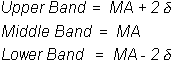
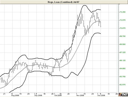
Bollinger Bands
Bollinger Bands
are a type of trading envelope. They are lines at an interval around the
moving average. They consist of a moving average and two different
standard deviations represented as a line above the MA (Moving Average)
and a line below the MA. The line above is the MA plus two standard
deviations; the line below is the MA minus two standard deviations.
Bollinger Bands are used to determine overbought and oversold conditions
and to project price targets.
John Bollinger
created Bollinger Bands in an effort to gauge the volatility and
condition of a market. These bands are used to determine the trading
range and give an indication of when to buy and when to sell. Bollinger
Bands are also used to indicate market volatility, the wider the bands
the greater the volatility. Inversely, the narrower the bands, the
lesser the volatility. By plotting two lines at an interval around a
moving average, Bollinger bands give a good indication of market
conditions and price relation. The moving average which the band is
based on works as an indicator to confirm trade signals.
Calculation
Calculate the
moving average with this formula:
Subtract the
moving average from each of the individual data points used in the
moving average calculation. This gives you a list of deviations from the
average. Square each deviation and add them all together. Divide this
sum by the number of periods you selected.
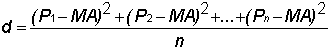
Take the square
root of d. This gives you the standard deviation.

Compute the
bands by using the following formulas:
Pn: The
price you pay for the nth interval.
n:
The number of periods you select.
Buy/Sell Signals
A buy signal
occurs when a chart bottom is below the lower band followed by a bottom
above the lower band. A sell signal occurs when a chart top is above the
uppermost band followed by another top that is below the upper band.
Preferences
Right-click
anywhere on the chart and go to “Overlay Properties.” Select Bollinger
Bands from the list. The preferences will appear in the Control Panel.
(Once you click on the chart, the Preference tab will go back to chart
settings.)
Restore
Settings: TNT Default will change your settings back to the original
software settings. My Default will change current settings to your
personalized default settings. Apply To All Charts will apply your
selected settings on all open charts. Save As My Default will save your
current personal settings.
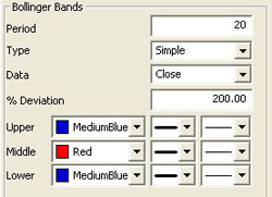 |
Period:
The number of bars used to calculate the study. John Bollinger, the
creator of this study, states that those periods of less than ten days
do not seem to work well for Bollinger Bands. He says the optimal period
for most applications is 20 or 21. Default is 20. To add a
displacement, add a second number in the period box (with only a
space between the two numbers.)
|
Type: Select
Simple, Linear Weight, or Exponential.
Data: Select Open, High, Low, or Close.
% Deviation:
The percent of one standard deviation. John Bollinger suggests that if
you reduce the number of days used to calculate the bands, you should
also reduce the number of deviations and vise versa. For example, 200
percent of a standard deviation means two deviations above and two
deviations below the moving average. If you use a period of 50, you may
want to use 250 percent of a standard deviation. For a period of 10, you
may want to use 150 or 100 percent.
Upper,
Middle, Lower: Choose the color, line style, and line
thickness of your indicator line.
Back To Top
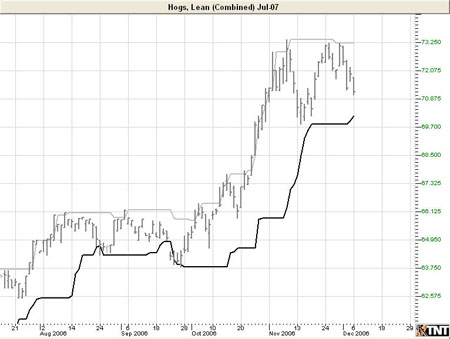
Donchian Channels (DON)
Donchian
Channels were created by Richard Donchian, an expert in trends. The DON
is a simple trend breakout system. The channel works well in trending
markets, but not as well in sideways moving markets.
Donchian
Channels measure volatility by placing bands at a specified period
deviation. These bands are charted two standard deviations from the
market price. As the market price changes, the value of two standard
deviations also changes. This value is what comprises the Donchian
Channel’s band width, representing the expanding and contracting of the
bands based on recent price volatility.
Calculation
The calculation
of the DON is here:
Donchian Channel
High = MAX (HI, n)
Donchian Channel
Low = MAX (LO, n)
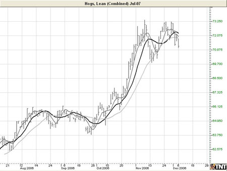
Example of Donchian Channels
Preferences
Right-click
anywhere on the chart and go to “Overlay Properties.” Select Donchian
Channels from the list. The preferences will appear in the Control
Panel. (Once you click on the chart, the Preference tab will go back to
chart settings.)
Restore
Settings: TNT Default will change your settings back to the original
software settings. My Default will change current settings to your
personalized default settings. Apply To All Charts will apply your
selected settings on all open charts. Save As My Default will save your
current personal settings.
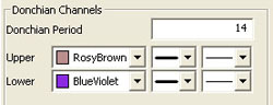 |
Donchian
Period: Specify the number of days in a period. To add a
displacement, add a second number in the period box (with only a
space between the two numbers.)
Upper,
Lower: Choose the color, line style, and line thickness of your
indicator line.
|
Back To Top
Keltner Bands
Kelter Bands
were developed by Chester Keltner and Modified by Linda Raschke. They
are traditional moving average envelopes based on Exponential Moving
Averages. The probability is that prices will remain within the channel,
as with all band-type indicators. A break above the channel is an
anticipation of higher prices. When prices close below the lower band,
we anticipate lower prices.
The middle line
(20 period EMA) in a rising market should provide support. In a falling
market, the middle line should provide resistance. Keltner Bands, as
with any moving average indicator, seem to work great in strongly
tending markets, but not so well in sideways markets. Just like all
trend-following systems, the Keltner Bands are not meant to spot tops or
bottoms. Use the Keltner Bands in conjunction with other indicators such
as RSI or MACD. Using it in combination with either of these will help
provide verification of the strength of a market.
Example of
Keltner Bands

Calculation
The calculation
for the top, or Plus Band, is here:
2 (ATR over 10
periods) + (20 period exponential moving average)
The calculation
for the bottom, or Minus Band, is here:
2 (ATR over 10
periods) - (20 period exponential moving average)
Preferences
Right-click
anywhere on the chart and go to “Overlay Properties.” Select Keltner
Bands from the list. The preferences will appear in the Control Panel.
(Once you click on the chart, the Preference tab will go back to chart
settings.)
Restore
Settings: TNT Default will change your settings back to the original
software settings. My Default will change current settings to your
personalized default settings. Apply To All Charts will apply your
selected settings on all open charts. Save As My Default will save your
current personal settings.
 |
Period:
Specify the number of days used. To add a displacement, add a
second number in the period box (with only a space between the two
numbers.)
Type: Select
Simple, Linear Weight, or Exponential.
Band Calculation:
Select Original or ATR and enter values of your own.
Upper,
Middle, Lower: Choose the color, line style, and line
thickness of your indicator line.
|
Back To Top
Moving Average Lines
The moving
average, or simple moving average, represents the average of the last
several closing prices. The moving average is simple to compute, easy to
understand, and reliable under tests. This simplicity is the strength of
the moving average.
The basic moving
average is computed the same as any other mathematical average. The most
common way of determining the moving average of a market is to take the
closing price over a certain number of days, add them together, and
divide by the select number of days.
Moving averages
are generally thought to be indicators of trend. For example,
conventional interpretation is that once prices cross from below the
moving average to above it, the trend is considered up. On the other
hand, if prices go from above the moving average to below it, the trend
of the market is considered down.
The purpose of
the simple moving average is to track the progress of the trend. Moving
averages can potentially keep you in the trend for a long time. The
moving average gives you an indication of the trend being up (prices
above the moving average) or down (below the moving average). However,
the moving average gives you no indication of the length or duration of
the trend.
Double Moving
Average
Double moving
averages use two different averages in tandem. The first average is
generally a faster reacting average using a shorter period of time,
usually 10 days. The second average is a slower reacting average that
will indicate longer-term price movement.
Using these two
averages together helps to alleviate whipsaws by giving a basis of
comparison. The faster average breaking above the slower average is a
buy signal, the faster average breaking below the slower average is a
sell signal.
When using two
different moving averages the trader gets a clearer picture of price
indications. By combining a slower moving 20-day average, with a quicker
reacting 10-day average, you can see where the long-term indications are
going.
You would sell
once the faster moving average crosses below the slower trend because
that’s an indication of change in trend. Near-term prices should be
rising at a greater rate than longer-term prices in a good upward
trending market, and vice versa for a down trend.
Triple Moving
Average
The system of
triple moving averages is employed by plotting three different moving
averages together. The first of these averages is a faster average that
only looks at the short-term price direction. The second average is a
medium average that reacts to a longer period of time, but not as long
as the final average. The third average is the slowest to react, because
it takes an average of the longest period of time.
A 10, 20, and 40
day moving average system would be considered a triple moving average.
The first average, the 10-day, is the quickest to move when prices show
a change. The second average, the 20-day, is the medium average that
does not show change until the prices have moved for a longer period of
time. Finally the slowest moving of the averages is the 40-day. This
slow average will not indicate a difference until prices have made a
significant move. Shorter-term moving averages, being more sensitive to
changes in price, are said to follow the trend more closely. The middle
or medium average would follow less closely and the slowest or least
sensitive average would lag the most.
The use of the
triple moving average is to buy when all three averages move to be in an
upward trend or to sell when these averages are in a downtrend. The
upward trend appears when the fastest average is higher than both of the
other averages, the medium is above the slowest, and the longer term
moving average is on the bottom.
This look would
be reversed for a strong down trend with slow average on top, followed
by the medium average, and the fastest on bottom.
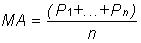
Calculation
The calculation
for the moving average is here:
Mat = (P1 +... +
Pn) / n
Mat: The
moving average for the current period.
Pn: The
price for the nth interval.
n: The
length of the moving average.
Compute the
average of the past n intervals using the price specified for that
period. Now use real values to compute a five interval moving average.
If you assume the following prices, the calculations are here:
MA = (7380 +
7375 + 7385 + 7390 + 7395) / 5
= 36925 / 5
= 7385
The calculation
for the Linearly Weighted is here:
Mat = [(P1 x (n
–1)] + …+ [Pn x (n – n)]
Denom = n + n-1
+ n-2 +…+ 1
MA = Mat / Denom
n:
The length of the moving average.
Pn: The
price for the nth interval.
MA: The
moving average for the current period.
The calculation
for the Exponential is here:
fPerc = 2 / (n +
1)
MAt = (P x fPerc)
+ [MA(t-1) x (1 – fPerc)]
MA: The
moving average for the current period.
t: The
current time period.
Example of
Moving Averages
Preferences
Right-click
anywhere on the chart and go to “Overlay Properties.” Select Moving
Averages from the list. The preferences will appear in the Control
Panel. (Once you click on the chart, the Preference tab will go back to
chart settings.)
Restore
Settings: TNT Default will change your settings back to the original
software settings. My Default will change current settings to your
personalized default settings. Apply To All Charts will apply your
selected settings on all open charts. Save As My Default will save your
current personal settings.
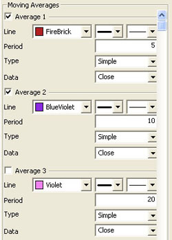 |
Line:
Choose the color, line style, and line thickness of your indicator line.
Period: The
number of bars, or interval, used to calculate the moving averages. To
add a displacement, add a second number in the period box (with
only a space between the two numbers.)
Type: Select
Simple, Linear Weight, or Exponential.
Data:
Select Open, High, Low, Close, Mean, Median, or Mode.
|
Back To Top
Parabolic Stop and Reversal (PSAR)
The Parabolic
SAR, developed by Welles Wilder, creator of RSI and DMI, sets trailing
price stops for either long or short positions. Also referred to as the
stop-and-reversal indicator, Parabolic SAR is more popular for setting
stops than for establishing direction or trend. Wilder recommended
establishing the trend first, and then trading with Parabolic SAR in the
direction of the trend. If the trend is up, but the underlying price
drops back below the trailing PSAR indicator, then sell or liquidate
your long position. If the trend is down, and the underlying price rises
above the trailing PSAR indicator then buy or liquidate your short
position.
Calculation
Once the market
establishes a direction, the initial SAR becomes the extreme price for
the two intervals. The extreme price is either the lowest price or
highest price for the two trading intervals. The short position uses the
high, and the long position uses the low.
The calculation
for the PSAR is here:
SARt = SARt-1 +
[ a x ( EPtrade - SARt-1) ]
SARt:
The stop and reverse price for the current interval.
SARt-1: The
stop and reverse price for the previous interval.
a:
The acceleration factor.
EPtrade:
The extreme price for the trade.
The SAR is
always the "stop and reverse" price point. This is the point you would
want to liquidate your current position and establish the opposite
position.
The acceleration
factor, a, is a weighting factor. In Wilder’s work, the initial
value for the acceleration factor is .02. The acceleration factor
increases by a value of .02 each time the extreme price changes for the
trade. You do not increment the acceleration factor if the extreme price
fails to change. The value for a, the acceleration factor, never exceeds
.20 in Wilder’s methodology.
The extreme
price (EP) for the trade is the highest or lowest price achieved
during the trade. If you have a long position, use the new highs as the
extreme price. When you have a short position, use the new lows as the
extreme price. The extreme price concept allows for normal market
corrections without immediately triggering the SAR price. It
keeps the SAR price moving in the direction of the market.
Example of PSAR

Preferences
Right-click
anywhere on the chart and go to “Overlay Properties.” Select Parabolic
SAR from the list. The preferences will appear in the Control Panel.
(Once you click on the chart, the Preference tab will go back to chart
settings.)
Restore
Settings: TNT Default will change your settings back to the original
software settings. My Default will change current settings to your
personalized default settings. Apply To All Charts will apply your
selected settings on all open charts. Save As My Default will save your
current personal settings.
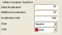 |
Initial,
Additional, Limit: Specify the calculation number you
would like each section of the indicator.
Style:
Choose how you would like the indicator displayed. Select squares,
crosses, dots, or lines.
Color:
Select the color of the indicator.
|
Back To Top
Pivot Points
Pivot points
used to be referred to as "traders numbers" because of the popularity of
these points amongst floor traders. The theory behind them is that
markets tend to have overlap from one period to another. On most days,
the daily high or low is within the previous day’s range, as with the
previous week’s extremes, and previous month’s extremes. In this sense,
pivot points are a counter trend indicator.
However, many
traders believe that once one point is violated, the next point will be
tested, making a violation of these support and resistance levels a clue
in trend following. Though we cannot vouch for the truth of this
statement, the popularity of pivot points amongst floor traders tends to
make these points worth watching.
The popularity
of these numbers can be seen on any day when the exchanges are
cleaned-up. The trading floor is literally piled high with folded pieces
of paper that contain pivot points calculated on them.
The uses of
pivot points varies greatly by trader. The most common function of the
daily pivot is as a guide. If prices are trading above the pivot point,
then the trend is considered up. Traders may wish to take short-term
positions on a violation of the daily pivot to the upside with an
initial upside objective of the 1st resistance level. If prices stall or
slow at the first resistance level, then aggressive traders may wish to
take profits. However, if the first Resistance level is violated to the
upside, then the market should go on to test the second resistance level.
If prices have violated the first resistance level, then this level should
act as support on future pullbacks, as should the pivot point.
The opposite is
true for support levels. A violation of the daily pivot to the downside
indicates that the daily trend is down, with a downside target being the
first support level. If the market stalls, then traders may wish to take
profits on short positions, or initiate long positions in anticipation
of a retracement to the daily pivot. However, if the first support level
is violated, the day is said to be a strongly down trending day, and as
such should move down further to test the second support level. As with
the resistance numbers, the support numbers, once violated, become
resistance lines to trade with in the trend.
Though
originally used as a means for floor trading, longer-term traders can
use pivot points for longer periods. Try plotting the weekly pivot
points on the daily chart and using it for shorter term positioning on
the daily charts. Pivot points can also be calculated using the monthly
pivot points on the daily chart, and used for longer-term positions.
Example of Pivot
Points
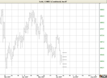
Calculation
There are
several methods used to determine the Pivot Point. We have included the
three different formulas in Track ‘n Trade 5.0.
Traditional
formulas:
Pivot Point = (H
+ L + C)/3
First Support
Line = (2 x Pivot Point) - H
First Resistance
Line = (2 x Pivot Point) - L
Second Support
Line = Pivot Point - (H - L)
Second
Resistance Line = Pivot + (H - L)
Variation 1:
This method
changes the formula used to derive the Pivot Point. The changes include
adding the trading day’s open and calculating the average of the four
values. With this variation, one takes into account both opening gaps
and overnight trading. The calculation is here:
Pivot Point =
(H* + L* + C* + O**) / 4
*=Yesterday
**=Today
Variation 2:
This method
changes the formula used to derive the Pivot Point as well. In this
method you substitute yesterday’s close with today’s open. Variation 2
also takes into account opening gaps and overnight trading. The
calculation is here:
Pivot Point =
(H* + L* + O**) / 3
*=Yesterday
**=Today
Preferences
Right-click
anywhere on the chart and go to “Overlay Properties.” Select Pivot
Points from the list. The preferences will appear in the Control Panel.
(Once you click on the chart, the Preference tab will go back to chart
settings.)
Restore
Settings: TNT Default will change your settings back to the original
software settings. My Default will change current settings to your
personalized default settings. Apply To All Charts will apply your
selected settings on all open charts. Save As My Default will save your
current personal settings.
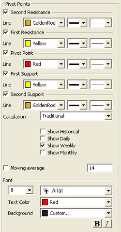 |
Pivot Points: Check the boxes to view
different support and resistance lines. Change the color, style,
and thickness of the lines.
Calculation: Select Traditional, Variation 1, or
Variation 2.
Display Settings: Check to display Historical, Daily,
Weekly, or Monthly pivot points.
Select if you would like to see the Moving average line
and enter the number of price bars you would like to be used to
calculate it.
Font: Select the font, size, and color of the text. You
can also choose to bold or italicize your text and change the
background color.
|
Back To Top
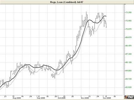
10x8 Moving Average Calculation
Just as it is
easier to ride a bike downhill than uphill, it seems prices fall faster
than they rise. Due to this perceived quirk in pricing, the legendary
market analyst, author, and seminar speaker, Jake Bernstein, developed
the 10x8 moving average system.
This system uses
two simple moving averages, but they are calculated in a slightly
different manner than those traditionally used. The first moving average
is a moving average of the daily highs, as opposed to that of the daily
settlement. The second moving average is calculated using the daily
lows.
Though Mr.
Bernstein recommends using a 10 period moving average of the daily highs
and an 8 period moving average of the daily lows based on his
observation that prices tend to fall about 20% faster than they rise,
any combination would do the trick. Generally, accepting market lore
that prices fall faster than they rise, the moving average of the lows
should be of shorter term duration than that of the highs.
The most basic
use of the 10x8 Moving Average is to look for a breakout above the upper
moving average to initiate a buy signal. When the daily settlement price
exceeds the average high of the last 10 days, this indicator flashes a
buy signal indicating that the trend of the market should be up.
Example of a 10x8 MAC
Preferences
Right-click
anywhere on the chart and go to “Overlay Properties.” Select 10x8 MAC
from the list. The preferences will appear in the Control Panel. (Once
you click on the chart, the Preference tab will go back to chart
settings.)
Restore
Settings: TNT Default will change your settings back to the original
software settings. My Default will change current settings to your
personalized default settings. Apply To All Charts will apply your
selected settings on all open charts. Save As My Default will save your
current personal settings.
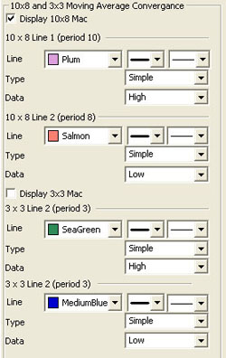 |
Display
10x8 MAC, 3x3 MAC: Check the boxes to display the lines you
would like to see.
Line: Choose
the color, line style, and line thickness of your indicator line.
Type: Select
Simple, Linear Weight, or Exponential.
Data: Select
Open, High, Low, Close, Mean, Median, or Mode.
|
Back To Top
Zig Zag
The Zig Zag
Indicator acknowledges minimum price changes and ignores those that do
not fit the criteria.
Calculation
A Zig Zag set at
10% with OHLC bars would yield a line that only reverses after a change
from high to low of 10% or greater. All movements less than 10% would be
ignored. If a commodity traded from a low of 100 to a high of 109, the
Zig Zag would not draw a line because the move was less than 10%. If the
stock advanced from a low of 100 to a high of 110, then the Zig Zag
would draw a line from 100 to 110. If the commodity continued on to a
high of 112, this line would be extended to 112 (100 to 112). The Zig
Zag would not reverse until the commodity declined 10% or more from its
high. From a high of 112, a commodity would have to decline 11.2 points
(or to a low of 100.8) for the Zig Zag to reverse and display another
line.
Example of a Zig
Zag

Preferences
Right-click
anywhere on the chart and go to “Overlay Properties.” Select Pivot
Points from the list. The preferences will appear in the Control Panel.
(Once you click on the chart, the Preference tab will go back to chart
settings.)
Restore
Settings: TNT Default will change your settings back to the original
software settings. My Default will change current settings to your
personalized default settings. Apply To All Charts will apply your
selected settings on all open charts. Save As My Default will save your
current personal settings.
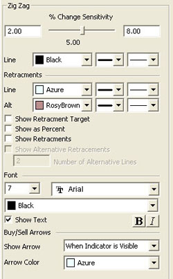 |
%
Change Sensitivity: Change the percent of calculation.
Line: Choose
the color, line style, and line thickness of your indicator line.
Retracements
Line, Alt: Choose the color, line style, and line thickness of the
retracement lines.
Select Show
Retracement Target, Show as Percent, Show Retracements, or Show Alternative
Retracements to show percents, retracements, and alternative
retracements.
Number of
Alternative Lines: Enter the amount of alternative retracement lines
you want to show on the chart.
Font:
Select the font, size, and color of the text. You can also
choose to bold or italicize your text. Select the checkbox next
to Show Text to hide or show your text on the chart.
Choose when you want
Buy/Sell Arrows to show and what color.
|
Back To Top
|